Showing posts with label histogram. Show all posts

Monday, September 24, 2012

Example 10.3: Enhanced scatterplot with marginal histograms


Back in example 8.41 we showed how to make a graphic combining a scatterplot with histograms of each variable. A commenter suggested we change the R graphic to allow post-hoc plotting of, for example, lowess lines. In addition, there are further refinements to be made.

In this R-only entry, we'll make the figure more flexible and a bit more robust. See the example linked above for SAS code, or check out Rick Wicklin discussing the same subject-- Rick gives some additional resources.


R
The R code relies heavily on the layout() function. We discussed it last time in a simpler setting with only one column of plots. The goal for the current plot is to enable a title for the whole figure-- this ought to be centered over the whole graphic-- and x- and y-axis labels. In the previous version, there was no title to the page at all and the axis titles would occasionally fail. To do this, we need a layout with a single cell at the top for the whole width of the graphic, a tall narrow cell at the left for the y-axis title, only in the bottom row, and a thin cell at the bottom, only on the left, for the x-axis title. This turns out to be fairly simple with layout() and the results can be checked with layout.show().
zones <- matrix(c(1,1,1, 
                  0,5,0, 
                  2,6,4, 
                  0,3,0), ncol = 3, byrow = TRUE)
layout(zones, widths=c(0.3,4,1), heights = c(1,3,10,.75))
layout.show(n=6)

The matrix input tells R to make the whole first row a single plot area, and that this will be the first thing plotted. The corners of the remaining 3*3 plot cells will be empty. The numbers in the matrix give the order in which the plot cells will be filled. This matrix is the key input to layout(), where we use the remaining options to give the relative widths and heights of the cells. It's possible to do this in the abstract, but is helpful to draw the intended layout first, then test whether the intended design was a achieved using the layout.show() function. The result is shown below. Putting the scatterplot in last will be useful for adding to it post hoc.


With that in hand, it's time to make a function. In generating last week's example, we noted that the layout persists-- that is, the graphics area retains the layout until you shut the graphics device or restore the old parameters. In the new plot, we'll add an option to revert to the old parameters (by default) or retain them. The latter option would be desirable, if, as suggested by a commenter, you wanted to add items to the scatterplot after generating the plot. We also add an option to allow different sized plot symbols.
scatterhist <- function(x, y, xlab = "", ylab = "", plottitle="", 
                        xsize=1, cleanup=TRUE,...){
  # save the old graphics settings-- they may be needed
  def.par <- par(no.readonly = TRUE)
  
  zones <- matrix(c(1,1,1, 0,5,0, 2,6,4, 0,3,0), ncol = 3, byrow = TRUE)
  layout(zones, widths=c(0.3,4,1), heights = c(1,3,10,.75))
  
  # tuning to plot histograms nicely
  xhist <- hist(x, plot = FALSE)
  yhist <- hist(y, plot = FALSE)
  top <- max(c(xhist$counts, yhist$counts))
  
  # for all three titles: 
  #   drop the axis titles and omit boxes, set up margins
  par(xaxt="n", yaxt="n",bty="n",  mar = c(.3,2,.3,0) +.05)
  # fig 1 from the layout
  plot(x=1,y=1,type="n",ylim=c(-1,1), xlim=c(-1,1))
  text(0,0,paste(plottitle), cex=2)
  # fig 2
  plot(x=1,y=1,type="n",ylim=c(-1,1), xlim=c(-1,1))
  text(0,0,paste(ylab), cex=1.5, srt=90)
  # fig 3
  plot(x=1,y=1,type="n",ylim=c(-1,1), xlim=c(-1,1))
  text(0,0,paste(xlab), cex=1.5)
  
  # fig 4, the first histogram, needs different margins
  # no margin on the left
  par(mar = c(2,0,1,1))
  barplot(yhist$counts, axes = FALSE, xlim = c(0, top),
          space = 0, horiz = TRUE)
  # fig 5, other histogram needs no margin on the bottom
  par(mar = c(0,2,1,1))
  barplot(xhist$counts, axes = FALSE, ylim = c(0, top), space = 0)
  # fig 6, finally, the scatterplot-- needs regular axes, different margins
  par(mar = c(2,2,.5,.5), xaxt="s", yaxt="s", bty="n")
  # this color allows traparency & overplotting-- useful if a lot of points
  plot(x, y , pch=19, col="#00000022", cex=xsize, ...)
  
  # reset the graphics, if desired 
  if(cleanup) {par(def.par)}
}

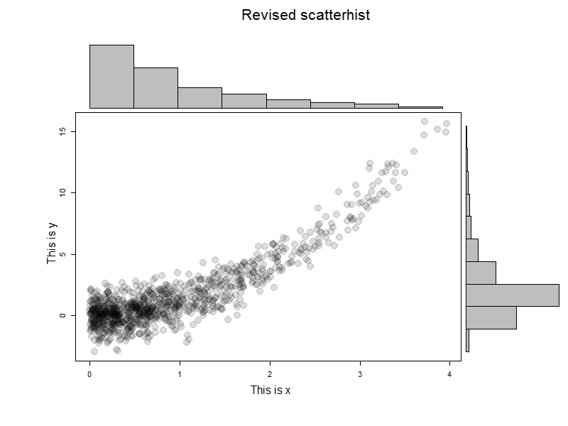
To test this, we'll generate some data and try it out. The results are immediately below; I like this example to help demonstrate that it's not the marginal normality of the data that matter.
x=rexp(1000)
y = x^2 + rnorm(1000)
scatterhist(x[x<4], y[x<4], ylab="This is x", xlab="This is y",   
  "Revised scatterhist", xsize =2)

But let's take advantage of the ability to add curves to the scatterplot.
x=rexp(1000)
y = x^2 + rnorm(1000)
scatterhist(x[x<4], y[x<4], ylab="This is x", xlab="This is y",   
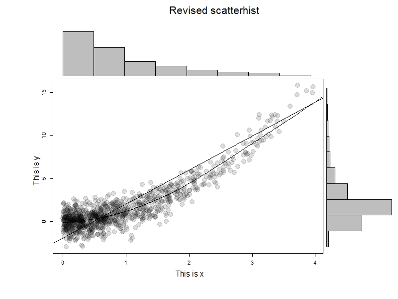
  "Revised scatterhist", xsize =2, cleanup=FALSE)
abline(lm(y~x))
lines(lowess(x,y))

The results are shown at the top-- we can do anything with the scatterplot that we'd be able to do if there were no layout() in effect.


An unrelated note about aggregators:We love aggregators! Aggregators collect blogs that have similar coverage for the convenience of readers, and for blog authors they offer a way to reach new audiences. SAS and R is aggregated by R-bloggers, PROC-X, and statsblogs with our permission, and by at least 2 other aggregating services which have never contacted us. If you read this on an aggregator that does not credit the blogs it incorporates, please come visit us at SAS and R. We answer comments there and offer direct subscriptions if you like our content. In addition, no one is allowed to profit by this work under our license; if you see advertisements on this page, the aggregator is violating the terms by which we publish our work.

Monday, June 20, 2011

Example 8.41: Scatterplot with marginal histograms


The scatterplot is one of the most ubiquitous, and useful graphics. It's also very basic. One of its shortcomings is that it can hide important aspects of the marginal distributions of the two variables. To address this weakness, you can add a histogram of each margin to the plot. We demonstrate using the SF-36 MCS and PCS subscales in the HELP data set.

SAS
SAS provides code to perform this using proc template and proc sgrender. These procedures are not intended for casual or typical SAS users. Its syntax is, to our eyes, awkward. This is roughly analogous to R functions that simply call C routines. Nonetheless, it's possible to adapt code that works. The code linked above was edited to set the transparency to 0 and to change the plotted symbol size to 5 from 11px. These options appear in the scatterplot statement about midway through the code.

Once the edited code is submitted, the following lines produce the plot shown above.

proc sgrender data="C:\book\help.sas7bdat" template=scatterhist;
dynamic YVAR="mcs" XVAR="pcs"
TITLE="MCS-PCS Relationship";
run;


R
For R, we adapted some code found in an old R-help post to generate the following function. The mtext() function puts text in the margins and is used here to label the axes. The at option in that function centers the label within the scatterplot data using some algebra.

scatterhist = function(x, y, xlab="", ylab=""){
zones=matrix(c(2,0,1,3), ncol=2, byrow=TRUE)
layout(zones, widths=c(4/5,1/5), heights=c(1/5,4/5))
xhist = hist(x, plot=FALSE)
yhist = hist(y, plot=FALSE)
top = max(c(xhist$counts, yhist$counts))
par(mar=c(3,3,1,1))
plot(x,y)
par(mar=c(0,3,1,1))
barplot(xhist$counts, axes=FALSE, ylim=c(0, top), space=0)
par(mar=c(3,0,1,1))
barplot(yhist$counts, axes=FALSE, xlim=c(0, top), space=0, horiz=TRUE)
par(oma=c(3,3,0,0))
mtext(xlab, side=1, line=1, outer=TRUE, adj=0,
at=.8 * (mean(x) - min(x))/(max(x)-min(x)))
mtext(ylab, side=2, line=1, outer=TRUE, adj=0,
at=(.8 * (mean(y) - min(y))/(max(y) - min(y))))
}

The results of the following code are shown below.

ds = read.csv("http://www.math.smith.edu/r/data/help.csv")
with(ds, scatterhist(mcs, pcs, xlab="MCS", ylab="PCS"))

Monday, June 13, 2011

Example 8.40: Side-by-side histograms


It's often useful to compare histograms for some key variable, stratified by levels of some other variable. There are several ways to display something like this. The simplest may be to plot the two histograms in separate panels.

SAS
In SAS, the most direct and generalizable approach is through the sgpanel procedure.


proc sgpanel data = 'c:\book\help.sas7bdat';
panelby female;
histogram cesd;
run;

The results are shown above.


R
In R, the lattice package provides a similarly direct approach.

ds = read.csv("http://www.math.smith.edu/r/data/help.csv")
ds$gender = ifelse(ds$female==1, "female", "male")
library(lattice)
histogram(~ cesd | gender, data=ds)

The results are shown below.

Monday, August 30, 2010

Example 8.3: pyramid plots


Pyramid plots are a common way to display the distribution of age groups in a human population. The percentages of people within a given age category are arranged in a barplot, often back to back. Such displays can be used distinguish males vs. females, differences between two different countries or the distribution of age at different timepoints. Aidan Kane has an example.

We demonstrate how to generate back to back pyramid plots by gender of the age distribution from the HELP (Health Evaluation and Linkage to Primary Care) study. The example today highlights the differences between the R community and the SAS corporate structure. The R function was constructed to do exactly a pyramid plot, while the SAS approach tricks a powerful but general approach to achieve approximately the desired results. The R result to our eyes are more attractive; to mimic them exactly in SAS would require drawing much of the content from primitives. Someone may have done this, but the software structure and user community isn't organized for sharing.

R

We begin by loading the data then creating a categorical age variable (in 5 year increments) using the cut() command (section 1.4.10). Next a character variable is created that will be used to display the five number summaries by gender (section 2.1.2).

ds = read.csv("http://www.math.smith.edu/sasr/datasets/help.csv")
attach(ds)
library(plotrix)

# create a categorical age variable
agegrp = cut(age, breaks=c(18, 20, 25, 30, 35, 40, 45, 50, 55, 60))

# create a nicer description for gender
gender = rep("male", length(agegrp))
gender[female==1] = "female"

# create a vector of percentages in each age range
women = as.vector(100*table(agegrp[female==1])/sum(female==1))
men = as.vector(100*table(agegrp[female==0])/sum(female==0))

# distribution by gender
tapply(age, gender, fivenum)


This yields the following output (five number summaries by gender):

$female
[1] 21.0 31.0 35.0 40.5 58.0

$male
[1] 19 30 35 40 60

Finally, the vectors of percentages at each level of the age variable for men and women is given as arguments to the pyramid.plot() function.

pyramid.plot(men, women,
labels=c("(18,20]","(20,25]","(25,30]","(30,35]",
"(35,40]","(40,45]","(45,50]","(50,55]","(55,60]"),
gap=5)
title("Age distribution at baseline of HELP study")

The age distributions are quite similar, with the males slightly more dispersed than the females.

SAS


We'll use proc gchart with the hbar statement (section 5.1.3) to make the plot. This requires some set-up, due to the desired back-to-back image. We begin, as in R, by generating the age categories and a gender variable. The strategy for categorizing age is shown in section 1.4.9.

data pyr;
set "c:\book\help";
agegrp = (age le 20) + (age le 25) + (age le 30) + (age le 35) +
(age le 40) + (age le 45) + (age le 50) + (age le 55) + (age le 60);
if female eq 1 then gender = "Female";
else gender = "Male";
run;


Next, we generate the percent in each age group, within gender, using proc freq (section 2.3.1). We save the output to a data set with the out option and suppress all the printed output. Then we make the percents for the males negative, so they'll display to the left of 0.


proc freq data=pyr noprint;
tables agegrp * gender/out=sumpyr outpct;
run;

data pyr2;
set sumpyr;
if gender eq "Male" then pct_col=pct_col * -1;
run;

We could proceed with the plot now, but the axes would include age categories 1 through 9 and negative percents for the males. To clean this up, we use axis statements (sections 5.3.7, 5.3.8).

title 'Age distribution at baseline of HELP study';
axis1 value = ("(55,60]" "(50,55]" "(45,50]" "(40,45]"
"(35,40]" "(30,35]" "(25,30]" "(20,25]" "(18,20]" ) ;
axis2 order=(-30 to 30 by 10)
label=("Percent in each age group, within gender")
minor = none
value = ("30" "20" "10" "0" "10" '20' '30');

proc gchart data=pyr2;
hbar agegrp / discrete freq nostats sumvar=pct_col space=0.5
subgroup=gender raxis=axis2 maxis=axis1;
label agegrp="Age";
run;
quit;

In the gchart statement, the key option is sumvar which tells proc gchart the length of the bars. The discrete option forces a bar for each value of agregrp. Other options associate the defined axis statements with axes of the plot, generate different colors for each gender, space the bars, and suppress some default plot features.

Different colored bars within gender could be accomplished with pattern statements. More difficult would be coloring the bars within gender by some third variables, as is demonstrated in R in example(pyramid.plot). Replicating the R plot with the category labels between the genders would require drawing the plot using annotate data sets.