Showing posts with label logic. Show all posts

Monday, April 9, 2012

Example 9.26: More circular plotting


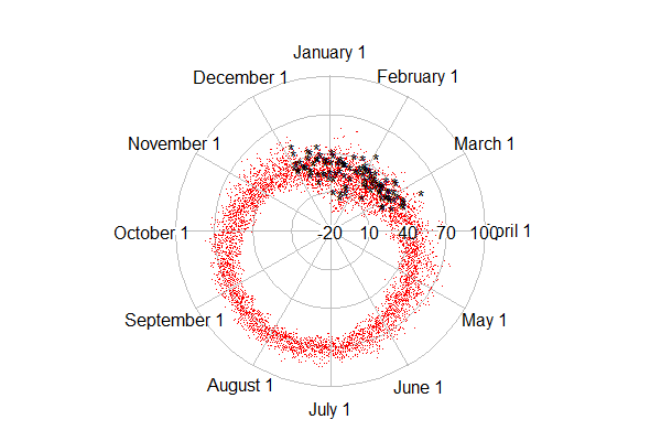
SAS's Rick Wicklin showed a simple loess smoother for the temperature data we showed here. Then he came back with a better approach that does away with edge effects. Rick's smoothing was calculated and plotted on a cartesian plane. In this entry we'll explore another option or two for smoothing, and plot the results on the same circular plot.

Since Rick is showing SAS code, and Robert Allison has done the circular plot (plot) (code), we'll stick to the R again for this one.

R
We'll start out by getting the data and setting it up as we did earlier. We add the year back into the matrix t3old because it'll be needed later.

temp1 = read.table("http://academic.udayton.edu/kissock/http/Weather/
gsod95-current/NYALBANY.txt")
leap = c(0,1,0,0,0,1,0,0,0,1,0,0,0,1,0,0,0,1)
days = rep(365,18) + leap
monthdays = c(31,28,31,30,31,30,31,31,30,31,30,31)
temp1$V3 = temp1$V3 - 1994

yearpart = function(daytvec,yeardays,mdays=monthdays){
part = (sum(mdays[1:(daytvec[1]-1)],(daytvec[1] > 2) * (yeardays[daytvec[3]]==366))
+ daytvec[2] - ((daytvec[1] == 1)*31)) / yeardays[daytvec[3]]
return(part)
}

temp2 = as.matrix(temp1)

radians = 2* pi * apply(temp2, 1, yearpart, days, monthdays)

t3old = matrix(c(temp1$V4[temp1$V4 != -99 & ((temp1$V3 < 18) )],
radians[temp1$V4 != -99 & ((temp1$V3 < 18) )],
temp1$V3[temp1$V4 != -99 & ((temp1$V3 < 18) )]), ncol=3)


t3now= matrix(c(temp1$V4[temp1$V4 != -99 & ((temp1$V3 == 18) |
(temp1$V3 == 17 & temp1$V1 == 12))],
radians[temp1$V4 != -99 & ((temp1$V3 == 18) |
(temp1$V3 == 17 & temp1$V1 == 12))]), ncol=2)

library(plotrix)
radial.plot(t3old[,1],t3old[,2],rp.type="s", point.col = 2, point.symbols=46,
clockwise=TRUE, start = pi/2, label.pos = (1:12)/6 * (pi),
radial.lim=c(-20,10,40,70,100), labels=c("February 1","March 1",
"April 1","May 1","June 1","July 1","August 1","September 1",
"October 1","November 1","December 1","January 1"))

radial.plot(t3now[,1],t3now[,2],rp.type="s", point.col = 1, point.symbols='*',
clockwise=TRUE, start = pi/2, add=TRUE, radial.lim=c(-20,10,40,70,100))

If you didn't happen to see the update on the previous entry, note that the radial.lim option makes the axes for the added points match those for the initial plot. Otherwise, the added points plotted lower than they appeared, making the recent winter look cooler.

Rick started with a smoother, but often cyclic data can be fit well parametrically, using the sine and cosine of the cycle length as the covariates. With the data set up in radians already, this is trivially simple. The predicted values for the data can be retrieved with the fitted() function (e.g., section 3.7.3), which works with many model objects. These can then be fed into the radial.plot() function with rp.type="p" to make a line plot. The result is shown at the top-- the parametric fit appears to do a good job. Of course, you can fit on a square plot very easily with the plot() function, with result shown below.

simple = lm(t3old[,1] ~ sin(t3old[,2]) + cos(t3old[,2]))

radial.plot(fitted(simple),t3old[,2],rp.type="p", clockwise=TRUE,
start = pi/2, add=TRUE, radial.lim=c(-20,10,40,70,100))

plot(t3old[,1] ~ t3old[,2], pch='.')
lines(t3old[,2],fitted(simple))


I didn't change the order of the data, so the line comes back to the beginning of the plot at the end of the year.

Adding a smoothed fit is nearly as easy. Just replace the lm() call with a loess() (section 5.2.6) call. The new line is added on top of the old one, to see just how they differ. The result is show below.

simploess = loess(t3old[,1] ~ t3old[,2])
radial.plot(fitted(simploess),t3old[,2],rp.type="p", line.col="blue",
clockwise=TRUE, start = pi/2, add=TRUE, radial.lim=c(-20,10,40,70,100))


The parametric fit is pretty good, but misses the sharp dip seen in January, and the fit in the late fall and early spring appear to be slightly affected.

But this approach stacks up all the data from 18 years. It might be more appropriate to stretch the data across the calendar time, fit the smoothed line to that, and then wrap it around the circular plot. To do this, we'll need to add the year back into the radians. Finding an acceptable smoother was a challenge-- the smooth.spline() function used here was adequate, but as the second plot below shows, it misses some highs and lows. Adding the smoothed curve to the plot is as easy as before, however. The plot with smoothing by year is immediately below.

radyear = t3old[,2] + (2 * pi * t3old[,3])
better = smooth.spline(y=t3old[,1],x= radyear, all.knots=TRUE,spar=1.1)

radial.plot(fitted(better),t3old[,2],rp.type="p", line.col="green",
clockwise=TRUE, start = pi/2, add=TRUE, radial.lim=c(-20,10,40,70,100))

plot(t3old[,1] ~ radyear, pch = '.')
lines(better)


The relatively poor fit seen below makes the new (green) line at least as poor as the parametric fit. The extra variability in the winter is reflected in distinct lines in the winter. Rick's approach, to fit the data lumping across years, seems to be the best for fitting, though it's easier to see the heteroscedaticity in the ciruclar plot. But however you slice it, this winter has had an unusual number of very warm days.


An unrelated note about aggregators
We love aggregators! Aggregators are meta-blogs that collect content from blogs that have similar coverage, for the convenience of readers. For blog authors they offer a way to reach new audiences. SAS and R is aggregated by R-bloggers and PROC-X with our permission, and by at least 2 other aggregating services which have never contacted us. If you read this on an aggregator that does not credit the blogs it incorporates, please come visit us at SAS and R. We answer comments there and offer direct subscriptions if you like our content. In addition, no one is allowed to profit by this work under our license; if you see advertisements on this page, the aggregator is violating the terms by which we publish our work.

Monday, April 2, 2012

Example 9.25: It's been a mighty warm winter? (Plot on a circular axis)


Updated (see below)


People here in the northeast US consider this to have been an unusually warm winter. Was it?

The University of Dayton and the US Environmental Protection Agency maintain an archive of daily average temperatures that's reasonably current. In the case of Albany, NY (the most similar of their records to our homes in the Massachusetts' Pioneer Valley), the data set as of this writing includes daily records from 1995 through March 12, 2012.

In this entry, we show how to use R to plot these temperatures on a circular axis, that is, where January first follows December 31st. We'll color the current winter differently to see how it compares. We're not aware of a tool to enable this in SAS. It would most likely require a bit of algebra and manual plotting to make it work.

R
The work of plotting is done by the radian.plot() function in the plotrix package. But there are a number of data management tasks to be employed first. Most notably, we need to calculate the relative portion of the year that's elapsed through each day. This is trickier than it might be, because of leap years. We'll read the data directly via URL, which we demonstrate in Example 8.31. That way, when the unseasonably warm weather of last week is posted, we can update the plot with trivial ease.

library(plotrix)
temp1 = read.table("http://academic.udayton.edu/kissock/http/
Weather/gsod95-current/NYALBANY.txt")
leap = c(0,1,0,0,0,1,0,0,0,1,0,0,0,1,0,0,0,1)
days = rep(365, 18) + leap
monthdays = c(31,28,31,30,31,30,31,31,30,31,30,31)
temp1$V3 = temp1$V3 - 1994

The leap, days, and monthdays vectors identify leap years, count the corrrect number of days in each year, and have the number of days in the month in non-leap years, respectively. We need each of these to get the elapsed time in the year for each day. The columns in the data set are the month, day, year, and average temperature (in Fahrenheit). The years are renumbered, since we'll use them as indexes later.

The yearpart() function, below, counts the proportion of days elapsed.

yearpart = function(daytvec,yeardays,mdays=monthdays){
part = (sum(mdays[1:(daytvec[1]-1)],
(daytvec[1] > 2) * (yeardays[daytvec[3]]==366))
+ daytvec[2] - ((daytvec[1] == 1)*31)) / yeardays[daytvec[3]]
return(part)
}

The daytvec argument to the function will be a row from the data set. The function works by first summing the days in the months that have passed (,sum(mdays[1:(daytvec[1]-1)]) adding one if it's February and a leap year ((daytvec[1] > 2) * (yeardays[daytvec[3]]==366))). Then the days passed so far in the current month are added. Finally, we subtract the length of January, if it's January. This is needed, because sum(1:0) = 1, the result of which is that that January is counted as a month that has "passed" when the sum() function quoted above is calculated for January days. Finally, we just divide by the number of days in the current year.

The rest is fairy simple. We calculate the radians as the portion of the year passed * 2 * pi, using the apply() function to repeat across the rows of the data set. Then we make matrices with time before and time since this winter started, admittedly with some ugly logical expressions (section 1.14.11), and use the radian.plot() function to make the plots. The options to the function are fairly self-explanatory.

temp2 = as.matrix(temp1)
radians = 2* pi * apply(temp2,1,yearpart,days,monthdays)

t3old = matrix(c(temp1$V4[temp1$V4 != -99 & ((temp1$V3 < 18) | (temp1$V2 < 12))],
radians[temp1$V4 != -99 & ((temp1$V3 < 18) | (temp1$V2 < 2))]),ncol=2)

t3now= matrix(c(temp1$V4[temp1$V4 != -99 &
((temp1$V3 == 18) | (temp1$V3 == 17 & temp1$V1 == 12))],
radians[temp1$V4 != -99 & ((temp1$V3 == 18) |
(temp1$V3 == 17 & temp1$V1 == 12))]),ncol=2)
# from plottrix library
radial.plot(t3old[,1],t3old[,2],rp.type="s", point.col = 2, point.symbols=46,
clockwise=TRUE, start = pi/2, label.pos = (1:12)/6 * (pi),
labels=c("February 1","March 1","April 1","May 1","June 1",
"July 1","August 1","September 1","October 1","November 1",
"December 1","January 1"), radial.lim=c(-20,10,40,70,100))

radial.plot(t3now[,1],t3now[,2],rp.type="s", point.col = 1, point.symbols='*',
clockwise=TRUE, start = pi/2, add=TRUE, radial.lim=c(-20,10,40,70,100))

The result is shown at the top. The dots (point.symbol is like pch so 20 is a point (section 5.2.2) show the older data, while the asterisks are the current winter. An alternate plot can be created with the rp.type="p" option, which makes a line plot. The result is shown below, but the lines connecting the dots get most of the ink and are not what we care about today.

Either plot demonstrates clearly that a typical average temperature in Albany is about 60 to 80 in August and about 10 to 35 in January, the coldest monthttp://www.blogger.com/img/blank.gifh.

Update
The top figure shows that it has in fact been quite a warm winter-- most of the black asterisks are near the outside of the range of red dots. Updating with more recent weeks will likely increase this impression. In the first edition of this post, the radial.lim option was omitted, which resulted in different axes in the original and "add" calls to radial.plot. This made the winter look much cooler. Many thanks to Robert Allison for noticing the problem in the main plot. Robert has made many hundreds of beautiful graphics in SAS, which can be found here. He also has a book. Robert also created a version of the plot above in SAS, which you can find here, with code here. Both SAS and R (not to mention a host of other environments) are sufficiently general and flexible that you can do whatever you want to do-- but varying amounts of expertise might be required.

An unrelated note about aggregators
We love aggregators! Aggregators collect blogs that have similar coverage for the convenience of readers, and for blog authors they offer a way to reach new audiences. SAS and R is aggregated by R-bloggers and PROC-X with our permission, and by at least 2 other aggregating services which have never contacted us. If you read this on an aggregator that does not credit the blogs it incorporates, please come visit us at SAS and R. We answer comments there and offer direct subscriptions if you like our content. In addition, no one is allowed to profit by this work under our license; if you see advertisements on this page, the aggregator is violating the terms by which we publish our work.
Tuesday, October 13, 2009

Example 7.15: A more complex sales graphic

The plot of Amazon sales rank over time generated in example 7.14 leaves questions. From a software perspective, we'd like to make the plot prettier, while we can embellish the plot to inform our interpretation about how the rank is calculated.

For the latter purpose, we'll create an indicator of whether the rank was recorded in nighttime (eastern US time) or not. Then we'll color the nighttime ranks differently than the daytime ranks.


SAS
In SAS, we use the timepart function to extract the time of day from the salestime variable which holds the date and time. This is a value measured in seconds since midnight, and we use some conditional logic (section 1.4.11) to identify hours before 8 AM or after 6 PM.


data sales2;
set sales;
if timepart(salestime) lt (8 * 60 * 60) or
timepart(salestime) gt (18 * 60 * 60) then night=1;
else night = 0;
run;


Then we can make the plot. We use the axis statement (sections 5.3.7 and 5.3.8) to specify the axis ranges, rotate some labels and headers, and remove the minor tick marks. Note that since the x-axis is a date-time variable, we have to specify the axis range using date-time data, here read in using formats (section A.6.4) and request labels every three days by requesting an interval of three days' worth of seconds. We also use the symbol statement (section 5.2.2, 5.3.11) to specify shapes and colors for the plotted points.


axis1 order = ("09AUG2009/12:00:00"dt to
"27AUG2009/12:00:00"dt by 259200)
minor = none;
axis2 order=(30000 to 290000 by 130000) label=(angle=90)
value=(angle=90) minor=none;
symbol1 i=none v=dot c=red h=.3;
symbol2 i=none v=dot c=black h=.3;


Finally, we request the plot using proc gplot. The a*b=c syntax (as in section 5.6.2) will result in different symbols for each value of the new night variable, and the symbols we just defined will be used. The haxis and vaxis options are used to associate each axis with the axis definitions specified in the axis statements.


proc gplot data=sales2;
plot rank*salestime=night / haxis=axis1 vaxis=axis2;
format salestime dtdate5.;
run; quit;


R
In R, we make a new variable reflecting the date-time at the midnight before we started collecting data. We then coerce the time values to numeric values using the as.numeric() function (section 1.4.2), while subtracting that midnight value. Next, we mod by 24 (using the %% operator, section B.4.3) and lastly round to the integer value (section 1.8.4) to get the hour of measurement. There's probably a more elegant way of doing this in R, but this works.


midnight <- as.POSIXlt("2009-08-09 00:00:00 EDT")
timeofday <- round(as.numeric(timeval-midnight)%%24,0)


Next, we prepare for making a nighttime indicator by intializing a vector with 0. Then we assign a value of 1 when the corresponding element of the hour of measurement vector has a value in the correct range.


night <- rep(0,length(timeofday))
night[timeofday < 8 | timeofday > 18] <- 1


Finally, we're ready to make the plot. We begin by setting up the axes, using the type="n" option (section 5.1.1) to prevent any data being plotted. Next, we plot the nighttime ranks by conditioning the plot vector on the value of the nighttime indicator vector; we then repeact for the daytime values, additionally specifying a color for these points. Lastly, we add a legend to the plot (section 5.2.14).


plot(timeval, rank, type="n")
points(timeval[night==1], rank[night==1], pch=20)
points(timeval[night==0], rank[night==0], pch=20,
col="red")
legend(as.POSIXlt("2009-08-22 00:00:00 EDT"), 250000,
legend=c("day", "night"), col=c("black", "red"),
pch=c(20, 20))


Interpretation: It appears that Amazon's ranking function adjusts for the pre-dawn hours, most likely to reflect a general lack of activity. (Note that these ranks are from Amazon.com. In all likelihood, Amazon.co.uk and other local Amazon sites adjust for local time similarly.) Perhaps some recency in sales allows a decline in rank for some books during these hours? In addition, we see that most sales of this book, as inferred from the discontinuous drops (improvement) in rank, tend to happen near the beginning of the day, or mid-day, rather than at night.