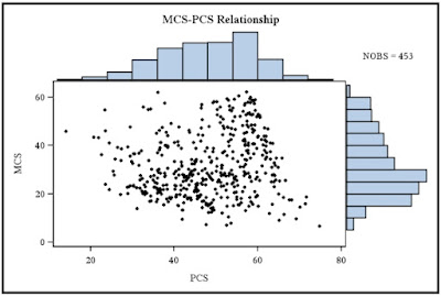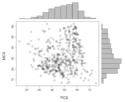
The scatterplot is one of the most ubiquitous, and useful graphics. It's also very basic. One of its shortcomings is that it can hide important aspects of the marginal distributions of the two variables. To address this weakness, you can add a histogram of each margin to the plot. We demonstrate using the SF-36 MCS and PCS subscales in the HELP data set.
SAS
SAS provides code to perform this using proc template and proc sgrender. These procedures are not intended for casual or typical SAS users. Its syntax is, to our eyes, awkward. This is roughly analogous to R functions that simply call C routines. Nonetheless, it's possible to adapt code that works. The code linked above was edited to set the transparency to 0 and to change the plotted symbol size to 5 from 11px. These options appear in the scatterplot statement about midway through the code.
Once the edited code is submitted, the following lines produce the plot shown above.
proc sgrender data="C:\book\help.sas7bdat" template=scatterhist;
  dynamic YVAR="mcs" XVAR="pcs"
          TITLE="MCS-PCS Relationship";
run;
R
For R, we adapted some code found in an old R-help post to generate the following function. The mtext() function puts text in the margins and is used here to label the axes. The at option in that function centers the label within the scatterplot data using some algebra.
scatterhist = function(x, y, xlab="", ylab=""){
  zones=matrix(c(2,0,1,3), ncol=2, byrow=TRUE)
  layout(zones, widths=c(4/5,1/5), heights=c(1/5,4/5))
  xhist = hist(x, plot=FALSE)
  yhist = hist(y, plot=FALSE)
  top = max(c(xhist$counts, yhist$counts))
  par(mar=c(3,3,1,1))
  plot(x,y)
  par(mar=c(0,3,1,1))
  barplot(xhist$counts, axes=FALSE, ylim=c(0, top), space=0)
  par(mar=c(3,0,1,1))
  barplot(yhist$counts, axes=FALSE, xlim=c(0, top), space=0, horiz=TRUE)
  par(oma=c(3,3,0,0))
  mtext(xlab, side=1, line=1, outer=TRUE, adj=0,
    at=.8 * (mean(x) - min(x))/(max(x)-min(x)))
  mtext(ylab, side=2, line=1, outer=TRUE, adj=0,
    at=(.8 * (mean(y) - min(y))/(max(y) - min(y))))
}
The results of the following code are shown below.
ds = read.csv("http://www.math.smith.edu/r/data/help.csv")
with(ds, scatterhist(mcs, pcs, xlab="MCS", ylab="PCS"))

9 comments:
For more details on modifying the SGRENDER code (including how to omit large sections of it), see http://blogs.sas.com/iml/index.php?/archives/139-How-to-Create-a-Scatter-Plot-with-Marginal-Histograms-in-SAS.html
I think changing the order of plot order in R could be helpful. so if we let the scatter plot to be plotted last then after we have drawn the graph, we can super-impose loess or regression lines afterward.
Hi, Rick-- I had intended to link to your entry, but that got lost in a draft somewhere. Thanks for correcting that omission.
And thanks for that idea, mkao-- makes sense to me. As a challenge, can you suggest how to modify the R code to make a title print correctly? I was unable to do it in the time I had available before this entry had to run.
Can a regression line be added to the scatterplot in SAS?
Hi JSF--
Anything is possible. This one turns out to be "easy", within the somewhat opaque graphics template language. All you have to do is add a "regressionplot" within the layout cell that contains the scatterplot. My modified version has this text after the modification outlined above and adding the regression line:
layout overlay / xaxisopts=(type=XTYPE) yaxisopts=(type=YTYPE);
scatterplot y=YVAR x=XVAR / datatransparency=0 markerattrs=(symbol=circlefilled size=5px);
regressionplot y=YVAR x=XVAR;
endlayout;
Hope that helps. To see more uses of the GTL, see this SUGI presentation paper: http://www2.sas.com/proceedings/sugi31/262-31.pdf
ggplot makes this easier
####
library(ggplot2)
library(ggExtra)
df <- data.frame(x, y)
p <- ggplot(df, aes(x, y)) + geom_point() + theme_classic() +
stat_smooth(method="loess", formula = y ~ x, size = 2)
ggExtra::ggMarginal(p, type = "histogram")
The abline() function plots the OLS regression onto an existing plot. So you can just add
abline(coef = coef(lm(y~x)))
after the plot() function in the existing code.
This is a wonderful piece of code. All the layout work has been
done upfront and the user doesn't't have to worry about it.
It is clean and easily modifiable. And, as a bonus, it doesn't use ggplot :-)
Thank you for sharing it.
Post a Comment