To celebrate the beginning of the professional baseball season here in the US and Canada, we revisit a famous example of using baseball data to demonstrate statistical properties.
In 1977, Bradley Efron and Carl Morris published a paper about the James-Stein estimator-- the shrinkage estimator that has better mean squared error than the simple average. Their prime example was the batting averages of 18 player in the 1970 season: they considered trying to estimate the players' average over the remainder of the season, based on their first 45 at-bats. The paper is a pleasure to read, and can be downloaded here. The data are available here, on the pages of Statistician Phil Everson, of Swarthmore College.
Today we'll review plotting the data, and intend to look at some other shrinkage estimators in a later entry.
SAS
We begin by reading in the data for Everson's page. (Note the long address would need to be on one line, or you could could use a URL shortener like TinyURL.com. To read the data, we use the infile statement to indicate a tab-delimited file and to say that the data begin in row 2. The informat statement helps read in the variable-length last names.
filename bb url "http://www.swarthmore.edu/NatSci/peverso1/Sports%20Data/
    JamesSteinData/Efron-Morris%20Baseball/EfronMorrisBB.txt";

data bball;
infile bb delimiter='09'x MISSOVER DSD lrecl=32767 firstobs=2 ;
informat firstname $7. lastname $10.;
input FirstName $ LastName $ AtBats Hits BattingAverage RemainingAtBats
   RemainingAverage SeasonAtBats SeasonHits SeasonAverage;
run;

data bballjs;
set bball;
js = .212 * battingaverage + .788 * .265;

avg = battingaverage; time = 1;
  if lastname not in("Scott","Williams", "Rodriguez", "Unser","Swaboda","Spencer")
    then name = lastname; else name = '';
output;
avg = seasonaverage; name = ''; time = 2; output;
avg = js; time = 3; name = ''; output;
run;
In the second data step, we calculate the James-Stein estimator according to the values reported in the paper. Then, to facilitate plotting, we convert the data to the "long" format, with three rows for each player, using the explicit output statement. The average in the first 45 at-bats, the average in the remainder of the season, and the James-Stein estimator are recorded in the same variable in each of the three rows, respectively. To distinguish between the rows, we assign a different value of time: this will be used to order the values on the graphic. We also record the last name of (most of) the players in a new variable, but only in one of the rows. This will be plotted in the graphic-- some players' names can't be shown without plotting over the data or other players' names.
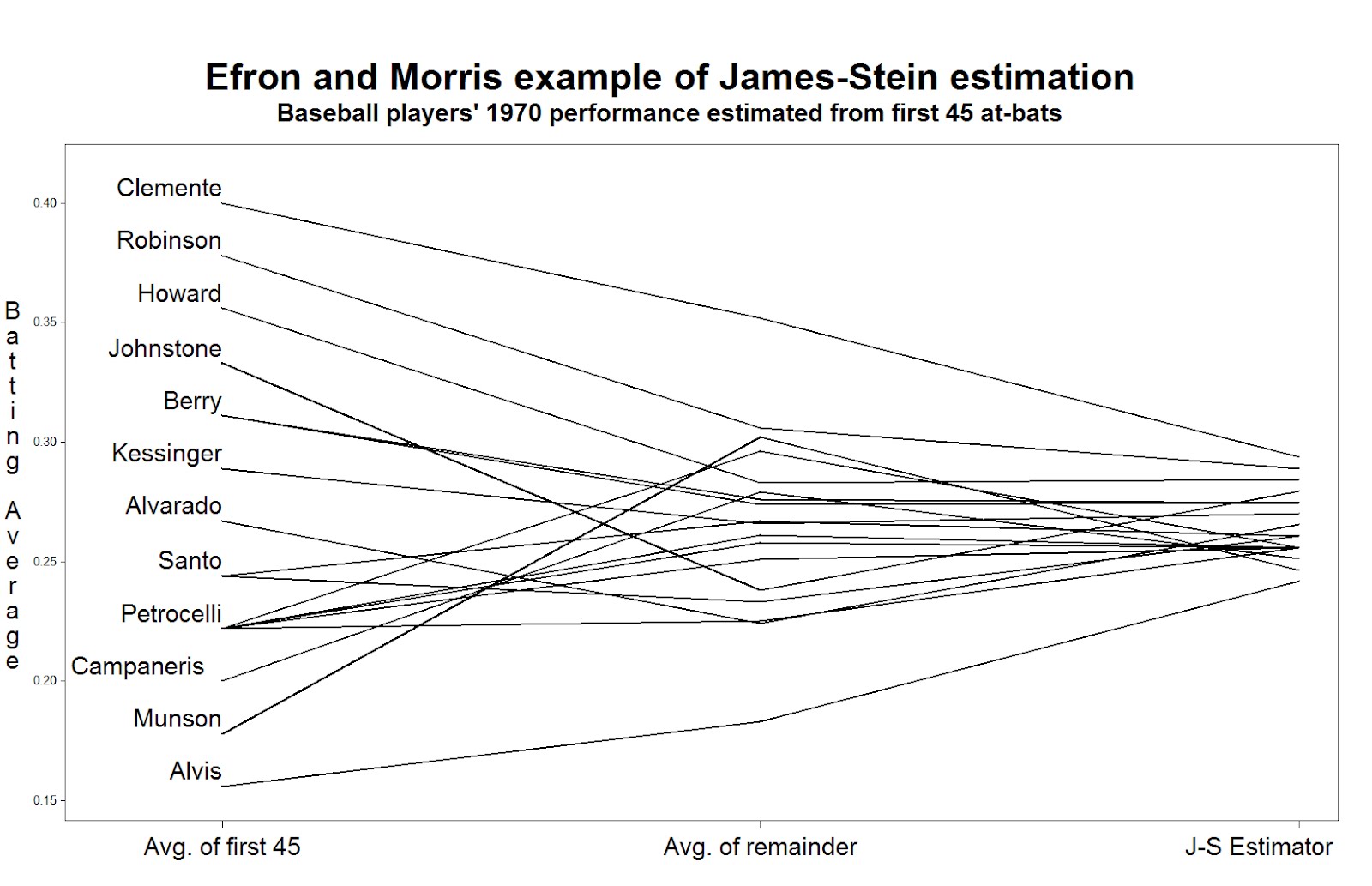
Now we can generate the plot. Many features shown here have been demonstrated in several entries. We call out 1) the h option, which increases the text size in the titles and labels, 2) the offset option, which moves the data away from the edge of the plot frame, 3) the value option in the axis statement, which replaces the values of "time" with descriptive labels, and 4) the handy a*b=c syntax which replicates the plot for each player.
title h=3 "Efron and Morris example of James-Stein estimation";
title2 h=2 "Baseball players' 1970 performance estimated from first 45 at-bats";
axis1 offset = (4cm,1cm) minor=none label=none
  value = (h = 2 "Avg. of first 45" "Avg. of remainder" "J-S Estimator");
axis2 order = (.150 to .400 by .050) minor=none offset=(0.5cm,1.5cm)
  label = (h =2 r=90 a = 270 "Batting Average");
symbol1 i = j v = none l = 1 c = black r = 20 w=3
  pointlabel = (h=2 j=l position = middle "#name");

proc gplot data = bballjs;
  plot avg * time = lastname / haxis = axis1 vaxis = axis2 nolegend;
run; quit;
To read the plot (shown at the top) consider approaching the nominal true probability of a hit, as represented by the average over the remainder of the season, in the center. If you begin on the left, you see the difference associated with using the simple average of the first 45 at-bats as the estimator. Coming from the right, you see the difference associated withe using the James-Stein shrinkage estimator. The improvement associated with the James-Stein estimator is reflected in the generally shallower slopes when coming from the left. With the exception of Pirates great Roberto Clemente and declining third-baseman Max Alvis, most every line has a shallower slope from the left; James' and Stein's theoretical work proved that overall the lines must be shallower from the right.
R
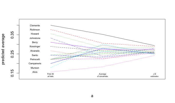
A similar process is undertaken within R. Once the data are loaded, and a subset of the names are blanked out (to improve the readability of the figure), the matplot() and matlines() functions are used to create the lines.
bball = read.table("http://www.swarthmore.edu/NatSci/peverso1/Sports%20Data/JamesSteinData/Efron-Morris%20Baseball/EfronMorrisBB.txt",
                   header=TRUE, stringsAsFactors=FALSE)
bball$js = bball$BattingAverage * .212 + .788 * (0.265)
bball$LastName[!is.na(match(bball$LastName,
  c("Scott","Williams", "Rodriguez", "Unser","Swaboda","Spencer")))] = ""

a = matrix(rep(1:3, nrow(bball)), 3, nrow(bball))
b = matrix(c(bball$BattingAverage, bball$SeasonAverage, bball$js),
   3, nrow(bball), byrow=TRUE)
matplot(a, b, pch=" ", ylab="predicted average", xaxt="n", xlim=c(0.5, 3.1), ylim=c(0.13, 0.42))
matlines(a, b)
text(rep(0.7, nrow(bball)), bball$BattingAverage, bball$LastName, cex=0.6)
text(1, 0.14, "First 45\nat bats", cex=0.5)
text(2, 0.14, "Average\nof remainder", cex=0.5)
text(3, 0.14, "J-S\nestimator", cex=0.5)