
Back in example 8.41 we showed how to make a graphic combining a scatterplot with histograms of each variable. A commenter suggested we change the R graphic to allow post-hoc plotting of, for example, lowess lines. In addition, there are further refinements to be made.
In this R-only entry, we'll make the figure more flexible and a bit more robust. See the example linked above for SAS code, or check out Rick Wicklin discussing the same subject-- Rick gives some additional resources.
R
The R code relies heavily on the layout() function. We discussed it last time in a simpler setting with only one column of plots. The goal for the current plot is to enable a title for the whole figure-- this ought to be centered over the whole graphic-- and x- and y-axis labels. In the previous version, there was no title to the page at all and the axis titles would occasionally fail. To do this, we need a layout with a single cell at the top for the whole width of the graphic, a tall narrow cell at the left for the y-axis title, only in the bottom row, and a thin cell at the bottom, only on the left, for the x-axis title. This turns out to be fairly simple with layout() and the results can be checked with layout.show().
zones <- matrix(c(1,1,1,
                  0,5,0,
                  2,6,4,
                  0,3,0), ncol = 3, byrow = TRUE)
layout(zones, widths=c(0.3,4,1), heights = c(1,3,10,.75))
layout.show(n=6)
The matrix input tells R to make the whole first row a single plot area, and that this will be the first thing plotted. The corners of the remaining 3*3 plot cells will be empty. The numbers in the matrix give the order in which the plot cells will be filled. This matrix is the key input to layout(), where we use the remaining options to give the relative widths and heights of the cells. It's possible to do this in the abstract, but is helpful to draw the intended layout first, then test whether the intended design was a achieved using the layout.show() function. The result is shown below. Putting the scatterplot in last will be useful for adding to it post hoc.

With that in hand, it's time to make a function. In generating last week's example, we noted that the layout persists-- that is, the graphics area retains the layout until you shut the graphics device or restore the old parameters. In the new plot, we'll add an option to revert to the old parameters (by default) or retain them. The latter option would be desirable, if, as suggested by a commenter, you wanted to add items to the scatterplot after generating the plot. We also add an option to allow different sized plot symbols.
scatterhist <- function(x, y, xlab = "", ylab = "", plottitle="",
                        xsize=1, cleanup=TRUE,...){
  # save the old graphics settings-- they may be needed
  def.par <- par(no.readonly = TRUE)

  zones <- matrix(c(1,1,1, 0,5,0, 2,6,4, 0,3,0), ncol = 3, byrow = TRUE)
  layout(zones, widths=c(0.3,4,1), heights = c(1,3,10,.75))

  # tuning to plot histograms nicely
  xhist <- hist(x, plot = FALSE)
  yhist <- hist(y, plot = FALSE)
  top <- max(c(xhist$counts, yhist$counts))

  # for all three titles:
  #   drop the axis titles and omit boxes, set up margins
  par(xaxt="n", yaxt="n",bty="n",  mar = c(.3,2,.3,0) +.05)
  # fig 1 from the layout
  plot(x=1,y=1,type="n",ylim=c(-1,1), xlim=c(-1,1))
  text(0,0,paste(plottitle), cex=2)
  # fig 2
  plot(x=1,y=1,type="n",ylim=c(-1,1), xlim=c(-1,1))
  text(0,0,paste(ylab), cex=1.5, srt=90)
  # fig 3
  plot(x=1,y=1,type="n",ylim=c(-1,1), xlim=c(-1,1))
  text(0,0,paste(xlab), cex=1.5)

  # fig 4, the first histogram, needs different margins
  # no margin on the left
  par(mar = c(2,0,1,1))
  barplot(yhist$counts, axes = FALSE, xlim = c(0, top),
          space = 0, horiz = TRUE)
  # fig 5, other histogram needs no margin on the bottom
  par(mar = c(0,2,1,1))
  barplot(xhist$counts, axes = FALSE, ylim = c(0, top), space = 0)
  # fig 6, finally, the scatterplot-- needs regular axes, different margins
  par(mar = c(2,2,.5,.5), xaxt="s", yaxt="s", bty="n")
  # this color allows traparency & overplotting-- useful if a lot of points
  plot(x, y , pch=19, col="#00000022", cex=xsize, ...)

  # reset the graphics, if desired
  if(cleanup) {par(def.par)}
}
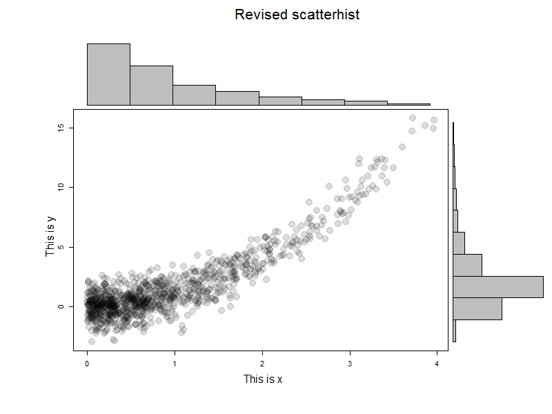
To test this, we'll generate some data and try it out. The results are immediately below; I like this example to help demonstrate that it's not the marginal normality of the data that matter.
x=rexp(1000)
y = x^2 + rnorm(1000)
scatterhist(x[x<4], y[x<4], ylab="This is x", xlab="This is y",
  "Revised scatterhist", xsize =2)
But let's take advantage of the ability to add curves to the scatterplot.
x=rexp(1000)
y = x^2 + rnorm(1000)
scatterhist(x[x<4], y[x<4], ylab="This is x", xlab="This is y",
  "Revised scatterhist", xsize =2, cleanup=FALSE)
abline(lm(y~x))
lines(lowess(x,y))
The results are shown at the top-- we can do anything with the scatterplot that we'd be able to do if there were no layout() in effect.
An unrelated note about aggregators:We love aggregators! Aggregators collect blogs that have similar coverage for the convenience of readers, and for blog authors they offer a way to reach new audiences. SAS and R is aggregated by R-bloggers, PROC-X, and statsblogs with our permission, and by at least 2 other aggregating services which have never contacted us. If you read this on an aggregator that does not credit the blogs it incorporates, please come visit us at SAS and R. We answer comments there and offer direct subscriptions if you like our content. In addition, no one is allowed to profit by this work under our license; if you see advertisements on this page, the aggregator is violating the terms by which we publish our work.


