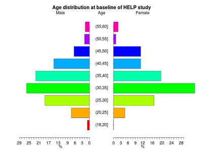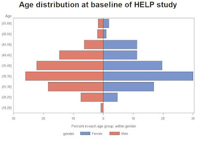
Pyramid plots are a common way to display the distribution of age groups in a human population. The percentages of people within a given age category are arranged in a barplot, often back to back. Such displays can be used distinguish males vs. females, differences between two different countries or the distribution of age at different timepoints. Aidan Kane has an example.
We demonstrate how to generate back to back pyramid plots by gender of the age distribution from the HELP (Health Evaluation and Linkage to Primary Care) study. The example today highlights the differences between the R community and the SAS corporate structure. The R function was constructed to do exactly a pyramid plot, while the SAS approach tricks a powerful but general approach to achieve approximately the desired results. The R result to our eyes are more attractive; to mimic them exactly in SAS would require drawing much of the content from primitives. Someone may have done this, but the software structure and user community isn't organized for sharing.
R
We begin by loading the data then creating a categorical age variable (in 5 year increments) using the cut() command (section 1.4.10). Next a character variable is created that will be used to display the five number summaries by gender (section 2.1.2).
ds = read.csv("http://www.math.smith.edu/sasr/datasets/help.csv")
attach(ds)
library(plotrix)

# create a categorical age variable
agegrp = cut(age, breaks=c(18, 20, 25, 30, 35, 40, 45, 50, 55, 60))

# create a nicer description for gender
gender = rep("male", length(agegrp))
gender[female==1] = "female"

# create a vector of percentages in each age range
women = as.vector(100*table(agegrp[female==1])/sum(female==1))
men = as.vector(100*table(agegrp[female==0])/sum(female==0))

# distribution by gender
tapply(age, gender, fivenum)
This yields the following output (five number summaries by gender):
$female
[1] 21.0 31.0 35.0 40.5 58.0

$male
[1] 19 30 35 40 60
Finally, the vectors of percentages at each level of the age variable for men and women is given as arguments to the pyramid.plot() function.
pyramid.plot(men, women,
   labels=c("(18,20]","(20,25]","(25,30]","(30,35]",
   "(35,40]","(40,45]","(45,50]","(50,55]","(55,60]"),
   gap=5)
title("Age distribution at baseline of HELP study")
The age distributions are quite similar, with the males slightly more dispersed than the females.
SAS

We'll use proc gchart with the hbar statement (section 5.1.3) to make the plot. This requires some set-up, due to the desired back-to-back image. We begin, as in R, by generating the age categories and a gender variable. The strategy for categorizing age is shown in section 1.4.9.
data pyr;
set "c:\book\help";
  agegrp = (age le 20) + (age le 25) + (age le 30) + (age le 35) +
  (age le 40) + (age le 45) + (age le 50) + (age le 55) + (age le 60);
  if female eq 1 then gender = "Female";
    else gender = "Male";
run;
Next, we generate the percent in each age group, within gender, using proc freq (section 2.3.1). We save the output to a data set with the out option and suppress all the printed output. Then we make the percents for the males negative, so they'll display to the left of 0.
proc freq data=pyr noprint;
  tables agegrp * gender/out=sumpyr outpct;
run;

data pyr2;
set sumpyr;
if gender eq "Male" then pct_col=pct_col * -1;
run;
We could proceed with the plot now, but the axes would include age categories 1 through 9 and negative percents for the males. To clean this up, we use axis statements (sections 5.3.7, 5.3.8).
title 'Age distribution at baseline of HELP study';
axis1 value = ("(55,60]" "(50,55]" "(45,50]" "(40,45]"
   "(35,40]" "(30,35]" "(25,30]"  "(20,25]" "(18,20]" ) ;
axis2 order=(-30 to 30 by 10)
label=("Percent in each age group, within gender")
minor = none
value = ("30" "20" "10" "0" "10" '20' '30');

proc gchart data=pyr2;
hbar agegrp / discrete freq nostats sumvar=pct_col space=0.5
   subgroup=gender raxis=axis2 maxis=axis1;
label agegrp="Age";
run;
quit;
In the gchart statement, the key option is sumvar which tells proc gchart the length of the bars. The discrete option forces a bar for each value of agregrp. Other options associate the defined axis statements with axes of the plot, generate different colors for each gender, space the bars, and suppress some default plot features.
Different colored bars within gender could be accomplished with pattern statements. More difficult would be coloring the bars within gender by some third variables, as is demonstrated in R in example(pyramid.plot). Replicating the R plot with the category labels between the genders would require drawing the plot using annotate data sets.
5 comments:
Check out my talk at last year's PhUSE for a way to do a similar plot (with two bars on each half row) with the new SAS 9.2 SGplot procedures. No template needed and no annotate dataset.
The code is in the presentation :
Clinical Trial Reporting with SAS ODS Graphics
http://www.lexjansen.com/phuse/2009/ts/ts11.pdf
and I have a paper version with more details - just email me for a copy.
Dave Garbutt
david.j.garbutt@gmail.com.not
oops.
I have run the SAS code and found a limitation: if a population group as 0 males and 0 females for a given age group, then even though the age group label is provided, the Plot does not show the age group label or vertical space for the 0-length male & female hbars. Example is when there are no Age < 1 males or females for a study population. I wish there was some way to control that - to leave the age group label space there so that multiple populations could be compared, many of which WOULD have Age < 1 males or females.
I understand your problem, Andy. I'm away from machines with SAS installed just now, but you might try the midpoints= option to the hbar statement.
In proc gplot, the uniform option keeps a set of axes across 'by' values, but that seems to be absent in proc gchart.
You can find here(http://stackoverflow.com/questions/14245361/population-pyramid-density-plot-in-r/14249027#14249027) some other example s using R.
Post a Comment