
Showing posts with label HELP data set. Show all posts

Tuesday, December 6, 2011

Example 9.17: (much) better pairs plots


Pairs plots (section 5.1.17) are a useful way of displaying the pairwise relations between variables in a dataset. But the default display is unsatisfactory when the variables aren't all continuous. In this entry, we discuss ways to improve these displays that have been proposed by John Emerson, Walton Green, Barret Schloerke, Dianne Cook, Heike Hofmann, and Hadley Wickham in a manuscript under review entitled The Generalized Pairs Plot. http://www.blogger.com/img/blank.gif

Implementations of the methods in the paper are available in the gpairs and GGally packages; here we use the latter, which is based on the grammar of graphics and the ggplot2 package. This is an R-only entry: we are unaware of efforts to replicate this approach in SAS.

New users may find it easier to break process down into steps, rather than to do everything at once, as the R language allows. One way to do that is to make a smaller version of a dataset, with just the analysis variables included. here we use the HELP data set and choose two categorical variables (gender and housing status) and two continuous ones (the number of drinks per day and a measure of depressive symptoms). Once this new subset is created, the call to ggpairs() is straightforward.

R

library(GGally)
ds = read.csv("http://www.math.smith.edu/r/data/help.csv")
ds$sex = as.factor(ifelse(ds$female==1, "female", "male"))
ds$housing = as.factor(ifelse(ds$homeless==1, "homeless", "housed"))
smallds = subset(ds, select=c("housing", "sex", "i1", "cesd"))
ggpairs(smallds, diag=list(continuous="density", discrete="bar"), axisLabels="show")

For users more comfortable with R, the ggpairs function allows you to select variables to include, via its columns option. The following line produces a plot identical to the above, without the subset().

ggpairs(ds, columns=c("housing", "sex", "i1", "cesd"),
diag=list(continuous="density", discrete="bar"), axisLabels="show")

Various options are available for the diagonal elements of the plot matrix, and the off-diagonals can be controlled with upper and lower options. The examples(ggpairs) command is very helpful for visualizing some of the possibilities.

Monday, October 31, 2011

Example 9.12: simpler ways to carry out permutation tests


In a previous entry, as well as section 2.4.3 of the book, we describe how to carry out a 2 group permutation test in SAS as well as with the coin package in R. We demonstrate with comparing the ages of the female and male subjects in the HELP study.

In this entry, we revisit the permutation test using other functions.

R

We describe a simpler interface to carry out and visualize permutation tests using the functions from the mosaic package.

We begin by replicating our previous example (section 2.6.4, p. 87).

ds = read.csv("http://www.math.smith.edu/r/data/help.csv")
library(coin)
numsim = 1000
oneway_test(age ~ as.factor(female),
distribution=approximate(B=numsim-1), data=ds)

which yields the following output:

Approximative 2-Sample Permutation Test

data: age by as.factor(female) (0, 1)
Z = -0.9194, p-value = 0.3894
alternative hypothesis: true mu is not equal to 0

We conclude that there is minimal evidence to contradict the null hypothesis that the two groups have the same ages back in their respective populations.

Now we demonstrate another way to run this test in a more general form, using the mosaic package's do() function combined with the * operator to repeatedly carry out fitting a linear model with a parameter for female which will calculate our test statistic (difference in means between females and males) repeatedly after shuffling the group indicators. The shuffle() function permutes the group labels, and then the summary statistic is calculated.

> library(mosaic)
> obsdiff = with(ds, mean(age[female==1]) - mean(age[female==0]))
> obsdiff
mean
0.7841284
> summary(age ~ female, data=ds, fun=mean)
age N=453

+-------+---+---+--------+
| | |N |mean |
+-------+---+---+--------+
|female |No |346|35.46821|
| |Yes|107|36.25234|
+-------+---+---+--------+
|Overall| |453|35.65342|
+-------+---+---+--------+

Now we can run the permutation test, then display the results on a souped-up histogram with different shading for values larger in magnitude than the observed statistic (see above).

res = do(numsim) * lm(age ~ shuffle(female), data=ds)
pvalue = sum(abs(res$female) > abs(obsdiff)) / numsim
xhistogram(~ female, groups = abs(female) > abs(obsdiff),
n=50, density=TRUE, data=res, xlab="difference between groups",
main=paste("Permutation test result: p=", round(pvalue, 3)))

The results are similar to those from the previous test: there is little evidence to contradict the null hypothesis.

SAS

In SAS, we'll take another approach, delving into the capabilities of proc iml to make a manual permutation test. We begin by reading the data and replicating the example in the book.

libname k 'c:\book';
proc npar1way data = k.help;
class female;
var age;
exact scores=data / mc n= 9999 alpha = .05;
run;

Data Scores One-Way Analysis

Chi-Square 0.8453
DF 1
Pr > Chi-Square 0.3579

Permuting data is a very awkward thing to do in data steps. But it turns out to be easy in proc iml (the built-in SAS matrix language). Here we read in the key variables from the data set (use and read). Then we generate the permutations (ranperm). However, this generates row for each permuted data set, while we need a column for each, so we transpose the matrix (t) before saving it. Then we save the resulting data in a SAS data set with the female variable. Note that we permuted the ages only, as opposed to the R example-- it doesn't matter which is permuted, of course. Much of the proc iml code used here can be found in section 1.9 of the book-- however, note that curly braces are required in the read statement, as shown below.

proc iml;
use k.help;
read all var{female age} into x;
p = t(ranperm(x[,2],1000));
paf = x[,1]||p;
create newds from paf;
append from paf;
quit;

With the permuted data in hand, we use proc ttest (section 2.4.1) with the ODS system to generate and save the differences. Note that the default variable names from proc iml are fairly nondescript. With the 1000 permuted statistics in hand, we can generate a histogram of the statistics and a p-value with proc univariate.

ods output conflimits=diff;
proc ttest data=newds plots=none;
class col1;
var col2 - col1001;
run;

proc univariate data=diff;
where method = "Pooled";
var mean;
histogram mean / normal;
run;

data diff2;
set diff;
absdiff = abs(mean);
run;

proc univariate data=diff2
loccount mu0 = 0.7841284;
where method = "Pooled";
var absdiff;
run;

Location Counts: Mu0=0.78

Count Value

Num Obs > Mu0 357
Num Obs ^= Mu0 1000
Num Obs < Mu0 643

Monday, October 17, 2011

Example 9.10: more regression trees and recursive partitioning with "partykit"


We discuss recursive partitioning, a technique for classification and regression using a decision tree in section 6.7.3 of the book. Support for these methods is available within the rpart package. Torsten Hothorn and Achim Zeileis have extended the support for these methods with the partykit package, which provides a toolkit with infrastructure for representing, summarizing, and visualizing tree-structured regression and classification models.

In this entry, we revisit the example from the book, which worked to classify predictors of homelessness in the HELP study.

R


ds = read.csv("http://www.math.smith.edu/r/data/help.csv")
library(rpart); library(partykit)
ds$sub = as.factor(ds$substance)
homeless.rpart = rpart(homeless ~ female + i1 + sub + sexrisk + mcs +
pcs, method="class", data=ds)
plot(homeless.rpart)
text(homeless.rpart)

This reproduces Figure 6.2 (p. 236) from the book, while we can display the output from the classification tree using the printcp() command.

> printcp(homeless.rpart)
Classification tree:
rpart(formula = home ~ female + i1 + sub + sexrisk + mcs + pcs,
data = ds, method = "class")
Variables actually used in tree construction:
[1] female i1 mcs pcs sexrisk

Root node error: 209/453 = 0.5
n= 453
CP nsplit rel error xerror xstd
1 0.10 0 1.0 1.0 0.05
2 0.05 1 0.9 1.1 0.05
3 0.03 4 0.8 1.1 0.05
4 0.02 5 0.7 1.0 0.05
5 0.01 7 0.7 0.9 0.05
6 0.01 9 0.7 0.9 0.05

Using the partykit package, we can make a nice graphic describing these results. We'll use the plot.party() function on a party object (coerced from the rpart object generated above using as.party()). This provides more information about the tree (as seen in the Figure above).

plot(as.party(homeless.rpart), type="simple")

More information as well as a lovely vignette can be found here.

SAS

Recursive partitioning is available through SAS Enterprise Miner, a module not always included in SAS installations.

Monday, February 7, 2011

Example 8.24: MplusAutomation and Mplus

In recent entries (here, here, and here), we've been fitting a series of latent class models using SAS and R. One of the most commonly used and powerful software package for latent class model estimation is Mplus. This commercial software includes support for many features that are not presently available in R or SAS. As an example, while the randomLCA package supports data with clustering, and the poLCA package supports polytomous variables, neither package supports clustering and polytomous variables.

In this entry, we demonstrate how to use the R package MplusAutomation to automate the process of fitting and interpreting a series of models using Mplus.

The key to all this magic is the template file which is used to create the Mplus input files. Here we demonstrate automating the creation of 4 models with 1, 2, 3, and 4 latent classes, using a template file called mplus.txt.

[[init]]
iterators = classes;
classes = 1:4;
dir = "Z:/field/blog";
filename = "mplus-[[classes]]-class-.inp";
outputDirectory = [[dir]];
[[/init]]
TITLE: [[classes]]-class
DATA: FILE IS mplus.dat;
VARIABLE: NAMES ARE homeless cesdcut satreat linkstatus;
CLASSES = c ([[classes]]);
CATEGORICAL = all;
ANALYSIS: TYPE = MIXTURE;
STARTS = 2000 200;
STITERATIONS=1000;
OUTPUT: TECH1 TECH10;
SAVEDATA: FILE IS "mplus-[[classes]]-class.cprob";
SAVE IS CPROB;

The package's createModels() function will loop through the four possible numbers of classes (1 through 4) and create separate Mplus input files. Multiple iterators are supported, and they can be referenced numerically or symbolically. This can be very helpful if there are different variables being used in each of the models, or other variations in the model.

When the createModels() function is run for this example, it generates 4 files. The file mplus-1-class-.inp looks like:

TITLE: 1-class
DATA: FILE IS mplus.dat;
VARIABLE: NAMES ARE homeless cesdcut satreat linkstatus;
CLASSES = c (1);
CATEGORICAL = all;
ANALYSIS: TYPE = MIXTURE;
STARTS = 2000 200;
STITERATIONS=1000;
OUTPUT: TECH1 TECH10;
SAVEDATA: FILE IS "mplus-1-class.cprob";
SAVE IS CPROB;

We call Mplus using the runModels() function after reading in the data and writing out a dataset in Mplus format (with prepareMplusData). Then the results can be collated and displayed.

ds = read.csv("http://www.math.smith.edu/r/data/help.csv")
attach(ds)
library(MplusAutomation)
cesdcut = ifelse(cesd>20, 1, 0)
smallds = na.omit(data.frame(homeless, cesdcut,
satreat, linkstatus))
prepareMplusData(smallds, file="mplus.dat")
createModels("mplus.txt")
runModels()
summary=extractModelSummaries()
models=readModels()

We see that the three class solution has the lowest AICC, while the one class solution has the lowest aBIC.

> summary
Title AnalysisType
1 1-class MIXTURE; STARTS = 2000 200; STITERATIONS=1000
2 2-class MIXTURE; STARTS = 2000 200; STITERATIONS=1000
3 3-class MIXTURE; STARTS = 2000 200; STITERATIONS=1000
4 4-class MIXTURE; STARTS = 2000 200; STITERATIONS=1000
DataType Estimator Observations Parameters LL
1 INDIVIDUAL MLR 431 4 -1045.656
2 INDIVIDUAL MLR 431 9 -1040.513
3 INDIVIDUAL MLR 431 14 -1032.484
4 INDIVIDUAL MLR 431 19 -1032.067
LLCorrectionFactor AIC BIC aBIC Entropy
1 1.000 2099.313 2115.577 2102.883 NA
2 1.019 2099.026 2135.621 2107.060 0.349
3 1.000 2092.967 2149.893 2105.465 0.941
4 1.000 2102.134 2179.390 2119.095 0.832
AICC Filename
1 2099.407 mplus-1-class-.out
2 2099.454 mplus-2-class-.out
3 2093.977 mplus-3-class-.out
4 2103.983 mplus-4-class-.out

Additional results for each of the specific models can be found in the returned objects.

> names(models)
[1] "mplus.1.class..out" "mplus.2.class..out"
[3] "mplus.3.class..out" "mplus.4.class..out"
> names(models$mplus.1.class..out)
[1] "parameters" "savedata" "summaries"

In a future entry, we'll explore more ways to utilize the information in the Mplus output, including displaying the prevalences in each group in a graphical manner.

Monday, January 31, 2011

Example 8.23: Expanding latent class model results

In Example 8.21 we described how to fit a latent class model to data from the HELP dataset using SAS and R (using poLCA(), and then followed up in example 8.22 using randomLCA(). In both entries, we classified subjects based on their observed (manifest) status on the following variables (on street or in shelter in past 180 days [homeless], CESD scores above 20, received substance abuse treatment [satreat], or linked to primary care [linkstatus]). We arbitrarily specify a three class solution.

In this example, we write a function to augment the default output of randomLCA() to make it easier for the analyst to interpret the results.

R

We begin by reading in the data.

ds = read.csv("http://www.math.smith.edu/r/data/help.csv")
attach(ds)
library(randomLCA)


We will write a function wrapper for randomLCA that does some additional work in a generic fashion. This will allow easier estimation of other models. We annotate the function to explain what we're doing. The resulting objects are outcomep, which contains the outcome probabilities, and classp, with the class probabilities.

runlca = function(df, nclass=2, names=c("item"), verbose=FALSE) {
nvars = dim(df)[2]

# create a list of names for the items
if (length(names)==1) { names = rep(names, nvars) }

# include only complete cases
bigtable = table(na.omit(df))
allpatterns = as.data.frame(ftable(bigtable))
# keep only the patterns that occur
nonzeropatterns = allpatterns[allpatterns$Freq > 0,]

# fit the model
results = randomLCA(nonzeropatterns[,1:nvars],
nonzeropatterns$Freq, nclass=nclass, calcSE=FALSE)

# display available sample size
cat("nobs=", results$nobs, "\n")
oldopt = options(digits=2)
if (verbose==TRUE) { # display patterns
whichclass = apply(results$classprob, 1, which.max)
nonzeropatterns$class = whichclass
print(nonzeropatterns[order(whichclass),])
}
print(summary(results))
resvals = cbind(results$outcomep, results$classp)

# label the margins with our desired variable names
# (plus class probability)
colnames(resvals) = c(names, "classprob")
# annotate standard output with rounded values
print(round(resvals, 2))
options(oldopt)
return(results)
}

Now let's apply the function. We start by creating a dichotomous variable with high scores on the CESD, and put this together as part of a dataframe to be given as input to the function. Then we call the runlca() function. By specifying the verbose option the code displays each of the patterns, sorted by which class it is in (based on the highest predicted probability).

cesdcut = ifelse(cesd>20, 1, 0)

smallds = data.frame(homeless, cesdcut, satreat, linkstatus)
results = runlca(smallds, nclass=3,
names=c("homeless", "cesd", "satreat", "linkstatus"),
verbose=TRUE)

This generates the following output:

nobs= 431
homeless cesdcut satreat linkstatus Freq class
5 0 0 1 0 16 1
7 0 1 1 0 33 1

6 1 0 1 0 4 2
8 1 1 1 0 37 2
13 0 0 1 1 1 2
14 1 0 1 1 4 2
15 0 1 1 1 9 2
16 1 1 1 1 23 2

1 0 0 0 0 17 3
2 1 0 0 0 15 3
3 0 1 0 0 82 3
4 1 1 0 0 64 3
9 0 0 0 1 10 3
10 1 0 0 1 9 3
11 0 1 0 1 62 3
12 1 1 0 1 45 3
Classes AIC BIC logLik
3 2093 2150 -1032
Class probabilities
Class 1 Class 2 Class 3
0.07846 0.21621 0.70534
Outcome probabilities
homeless cesd satreat linkstatus classprob
[1,] 0.00 0.58 1 0.00 0.08
[2,] 0.73 0.88 1 0.40 0.22
[3,] 0.44 0.83 0 0.41 0.71

The results are equivalent to the results from the prior example, but the predicted classes are listed, and the class probabilities (and proportion endorsing the item) are more clearly discernible. It might be useful in a later iteration of the function to add some blank lines and the proportion of the seeds that resulted in the maximum likelihood.

Monday, January 24, 2011

Example 8.22: latent class modeling using randomLCA

In Example 8.21 we described how to fit a latent class model to data from the HELP dataset using SAS and R. Subjects were classified based on their observed (manifest) status on the following variables (on street or in shelter in past 180 days [homeless], CESD scores above 20, received substance abuse treatment [satreat], or linked to primary care [linkstatus]). We arbitrarily specify a three class solution.

In this example, we fit the same model using the randomLCA() function within the package of the same name.

R

We begin by reading in the data.

ds = read.csv("http://www.math.smith.edu/r/data/help.csv")
attach(ds)
library(randomLCA)

We start by creating a dichotomous variable with high scores on the CESD, and put this together as part of a dataframe to be given as input.

cesdcut = ifelse(cesd>20, 1, 0)
smallds = na.omit(data.frame(homeless, cesdcut, satreat, linkstatus))
results = randomLCA(smallds, nclass=3, notrials=1000)
summary(results)

This generates the following output:

Classes AIC BIC logLik
3 2092.968 2149.893 -1032.484
Class probabilities
Class 1 Class 2 Class 3
0.07846 0.70534 0.21620
Outcome probabilities
homeless cesdcut satreat linkstatus
Class 1 9.465e-06 0.5786 1.000e+00 9.538e-06
Class 2 4.375e-01 0.8322 9.988e-06 4.145e-01
Class 3 7.297e-01 0.8846 1.000e+00 3.971e-01

The results are equivalent to the results from the prior example, though the scientific notation for the observed prevalences in each class are hard to read. Other objects are available from the returned value, though they are also not in an easily digestible form:

> names(results)
[1] "fit" "nclass" "classp" "outcomep"
[5] "se" "np" "nobs" "logLik"
[9] "observed" "fitted" "deviance" "classprob"
[13] "bics" "random" "level2" "byclass"
[17] "blocksize" "call" "probit" "quadpoints"
[21] "patterns" "notrials" "freq"
> results$patterns
homeless cesdcut satreat linkstatus
1 0 0 0 0
2 0 0 0 1
3 0 0 1 0
4 0 0 1 1
5 0 1 0 0
6 0 1 0 1
7 0 1 1 0
8 0 1 1 1
9 1 0 0 0
10 1 0 0 1
11 1 0 1 0
12 1 0 1 1
13 1 1 0 0
14 1 1 0 1
15 1 1 1 0
16 1 1 1 1
> results$freq
[1] 17 10 16 1 82 62 33 9 15 9 4 4 64 45 37 23

We'll address workarounds for these shortcomings in a future entry.

Tuesday, January 18, 2011

Example 8.21: latent class analysis

Latent class analysis is a technique used to classify observations based on patterns of categorical responses. Collins and Lanza's book,"Latent Class and Latent Transition Analysis," provides a readable introduction, while the UCLA ATS center has an online statistical computing seminar on the topic.

We consider an example analysis from the HELP dataset, where we wish to classify subjects based on their observed (manifest) status on the following variables: 1) on street or in shelter in past 180 days [homeless], 2) CESD score above 20, 3) received substance abuse treatment [satreat], or 4) linked to primary care [linkstatus]. We arbitrarily specify a three class solution.

SAS
Support for this method in SAS is available through the proc lca and proc lta add-on routines created and distributed by the Methodology Center at Penn State University. While it's customary in R to use researcher-written routines, it's less so for SAS; the machinery which allows independently written procs thus has the potential to mislead users. It bears explicitly stating that third-party procs probably don't have the same level of robustness or support as those distributed by SAS Institute.

The proc lca code assumes that the data exist in the dataset ds. The current coding of 0's and 1's needs to be changed to 1's and 2's.

data ds_0; set "c:\book\help.sas7bdat"; run;

data ds; set ds_0;
homeless = homeless+1;
cesdcut = (cesd > 20) + 1;
satreat = satreat+1;
linkstatus = linkstatus+1;
run;

The call to the LCA procedure specifies the number of classes, the variables to include, the number of categories per variable, and information about the starting values and random starts. It's highly recommended to run a "large" number of random starts to ensure that the true maximum likelihood estimate is reached (the 20 we used is likely too few for more complex models).

proc lca data=ds;
title '3 class model';
nclass 3;
items homeless cesdcut satreat linkstatus;
categories 2 2 2 2;
seed 42;
nstarts 20;
run;

The output begins with diagnostic information, and indicates that 40% of the seeds were associated with the best fitting model.

Data Summary, Model Information, and Fit Statistics (EM
Algorithm)

Number of subjects in dataset: 431
Number of subjects in analysis: 431

Number of measurement items: 4
Response categories per item: 2 2 2 2
Number of groups in the data: 1
Number of latent classes: 3
Rho starting values were randomly generated (seed = 42).

No parameter restrictions were specified (freely estimated).

Seed selected for best fitted model: 1486228051
Percentage of seeds associated with best fitted model: 40.00%

The model converged in 3241 iterations.

Maximum number of iterations: 5000
Convergence method: maximum absolute deviation (MAD)
Convergence criterion: 0.000001000

A number of fit statistics are provided to help with model comparison (e.g. number of classes, constraints in more complex models).

=============================================
Fit statistics:
=============================================
Log-likelihood: -1032.48
G-squared: 1.22
AIC: 29.22
BIC: 86.15
CAIC: 100.15
Adjusted BIC: 41.72
Entropy R-sqd.: 0.94
Degrees of freedom: 1

The results indicate that 22% of subjects are in class 1, just 8% in class 2, and 70% in class 3.

Parameter Estimates
Gamma estimates (class membership probabilities):
Class: 1 2 3
0.2163 0.0785 0.7052

The next set of output describes the classes. The prevalence for each level of each variable is described for each class. The last response category is redundant (equal to 1 minus the sum of the other probabilities).

Rho estimates (item response probabilities):
Response category 1:
Class: 1 2 3
homeless : 0.2703 1.0000 0.5625
cesdcut : 0.1154 0.4214 0.1678
satreat : 0.0004 0.0000 1.0000
linkstatus : 0.6029 1.0000 0.5855

Response category 2:
Class: 1 2 3
homeless : 0.7297 0.0000 0.4375
cesdcut : 0.8846 0.5786 0.8322
satreat : 0.9996 1.0000 0.0000
linkstatus : 0.3971 0.0000 0.4145

Members of class 1 were primarily homeless subjects with a larger proportion of high scores on the CESD, with substance abuse treatment history, and 40% of whom linked to primary care. Class 2 (the smallest group) was comprised of non-homeless subjects with lower CESD scores, substance abuse treatment, but no linkage. Class 3 was 44% homeless, had high levels of CESD, did not report substance abuse treatment, and 41% linked to primary care.

R

We begin by reading in the data, Then we use the within() function (section 1.3.1) to generate a dataframe with the variables of interest.

ds = read.csv("http://www.math.smith.edu/r/data/help.csv")
ds = within(ds, (cesdcut = ifelse(cesd>20, 1, 0)))


The poLCA package supports estimation of latent class models in R. The poLCA() function, like proc lca, can incorporate polytomous categorical variables, but also like proc lca requires the variables to be coded starting with positive integers. We specify 10 repetitions (with random starting values).

library(poLCA)
res2 = poLCA(cbind(homeless=homeless+1,
cesdcut=cesdcut+1, satreat=satreat+1,
linkstatus=linkstatus+1) ~ 1,
maxiter=50000, nclass=3,
nrep=10, data=ds)

This generates the following output:

Model 1: llik = -1032.889 ... best llik = -1032.889
Model 2: llik = -1032.889 ... best llik = -1032.889
Model 3: llik = -1032.484 ... best llik = -1032.484
Model 4: llik = -1032.889 ... best llik = -1032.484
Model 5: llik = -1032.889 ... best llik = -1032.484
Model 6: llik = -1032.484 ... best llik = -1032.484
Model 7: llik = -1032.484 ... best llik = -1032.484
Model 8: llik = -1032.889 ... best llik = -1032.484
Model 9: llik = -1032.889 ... best llik = -1032.484
Model 10: llik = -1032.889 ... best llik = -1032.484
Conditional item response (column) probabilities,
by outcome variable, for each class (row)

$homeless
Pr(1) Pr(2)
class 1: 0.2703 0.7297
class 2: 1.0000 0.0000
class 3: 0.5625 0.4375

$cesdcut
Pr(1) Pr(2)
class 1: 0.1154 0.8846
class 2: 0.4213 0.5787
class 3: 0.1678 0.8322

$satreat
Pr(1) Pr(2)
class 1: 0 1
class 2: 0 1
class 3: 1 0

$linkstatus
Pr(1) Pr(2)
class 1: 0.6029 0.3971
class 2: 1.0000 0.0000
class 3: 0.5855 0.4145

Estimated class population shares
0.2162 0.0785 0.7053

Predicted class memberships (by modal posterior prob.)
0.181 0.1137 0.7053

=========================================================
Fit for 3 latent classes:
=========================================================
number of observations: 431
number of estimated parameters: 14
residual degrees of freedom: 1
maximum log-likelihood: -1032.484

AIC(3): 2092.967
BIC(3): 2149.893
G^2(3): 1.221830 (Likelihood ratio/deviance statistic)
X^2(3): 1.233247 (Chi-square goodness of fit)

The results are consistent with those found in proc lca. We note that, also similar to proc lca the global maximum likelihood estimates were reached 3 times out of 10-- this can be discerned by examination of the 10 model results. It's always a good idea to fit a large number of iterations to ensure that the global maximum likelihood estimates have been reached.

Tuesday, October 26, 2010

Example 8.11: violin plots


We've continued to get useful feedback and ideas from our posts on the combination dotplot/boxplot and other ways to craft similar displays.

Another notion is the violin plot, which combines a boxplot and a (doubled) kernel density plot. While the basic notion of the violin plot does not include the individual points, such a display has virtues, particularly when comparing multiple groups and with large datasets. For teaching purposes, dots representing the data points could be added in. More details on the plot can be found in: Hintze, J. L. and R. D. Nelson (1998). Violin plots: a box plot-density trace synergism. The American Statistician, 52(2):181-4.

R

In R, the vioplot package includes the vioplot() function, which generated the plot at the top of this entry.

ds = read.csv("http://www.math.smith.edu/r/data/help.csv")
female = subset(ds, female==1)
library(vioplot)
with(female, vioplot(pcs[homeless==0], pcs[homeless==1],
horizontal=TRUE, names=c("non-homeless", "homeless"),
col = "lightblue"))


SAS

We've neglected SAS in the discussion of teaching graphics. Mimicking the tailored appearance of Wild's approach to the dotplot-boxplot would require at least several hours, while even the shorter code suggested by commenters would be difficult. For the most part this reflects the modular nature of R. However violin plots are similar enough to stacked kernel density estimates, that we show them here in order to demonstrate the code.

proc sgpanel data="C:\book\help";
where female eq 1;
panelby homeless / columns=1 ;
density pcs / scale=percent type=kernel ;
run;

The output lacks the graphic depiction of central tendency, and does not double the density, but it does highlight similarities and differences between the categories.

Monday, August 30, 2010

Example 8.3: pyramid plots


Pyramid plots are a common way to display the distribution of age groups in a human population. The percentages of people within a given age category are arranged in a barplot, often back to back. Such displays can be used distinguish males vs. females, differences between two different countries or the distribution of age at different timepoints. Aidan Kane has an example.

We demonstrate how to generate back to back pyramid plots by gender of the age distribution from the HELP (Health Evaluation and Linkage to Primary Care) study. The example today highlights the differences between the R community and the SAS corporate structure. The R function was constructed to do exactly a pyramid plot, while the SAS approach tricks a powerful but general approach to achieve approximately the desired results. The R result to our eyes are more attractive; to mimic them exactly in SAS would require drawing much of the content from primitives. Someone may have done this, but the software structure and user community isn't organized for sharing.

R

We begin by loading the data then creating a categorical age variable (in 5 year increments) using the cut() command (section 1.4.10). Next a character variable is created that will be used to display the five number summaries by gender (section 2.1.2).

ds = read.csv("http://www.math.smith.edu/sasr/datasets/help.csv")
attach(ds)
library(plotrix)

# create a categorical age variable
agegrp = cut(age, breaks=c(18, 20, 25, 30, 35, 40, 45, 50, 55, 60))

# create a nicer description for gender
gender = rep("male", length(agegrp))
gender[female==1] = "female"

# create a vector of percentages in each age range
women = as.vector(100*table(agegrp[female==1])/sum(female==1))
men = as.vector(100*table(agegrp[female==0])/sum(female==0))

# distribution by gender
tapply(age, gender, fivenum)


This yields the following output (five number summaries by gender):

$female
[1] 21.0 31.0 35.0 40.5 58.0

$male
[1] 19 30 35 40 60

Finally, the vectors of percentages at each level of the age variable for men and women is given as arguments to the pyramid.plot() function.

pyramid.plot(men, women,
labels=c("(18,20]","(20,25]","(25,30]","(30,35]",
"(35,40]","(40,45]","(45,50]","(50,55]","(55,60]"),
gap=5)
title("Age distribution at baseline of HELP study")

The age distributions are quite similar, with the males slightly more dispersed than the females.

SAS
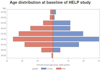


We'll use proc gchart with the hbar statement (section 5.1.3) to make the plot. This requires some set-up, due to the desired back-to-back image. We begin, as in R, by generating the age categories and a gender variable. The strategy for categorizing age is shown in section 1.4.9.

data pyr;
set "c:\book\help";
agegrp = (age le 20) + (age le 25) + (age le 30) + (age le 35) +
(age le 40) + (age le 45) + (age le 50) + (age le 55) + (age le 60);
if female eq 1 then gender = "Female";
else gender = "Male";
run;


Next, we generate the percent in each age group, within gender, using proc freq (section 2.3.1). We save the output to a data set with the out option and suppress all the printed output. Then we make the percents for the males negative, so they'll display to the left of 0.


proc freq data=pyr noprint;
tables agegrp * gender/out=sumpyr outpct;
run;

data pyr2;
set sumpyr;
if gender eq "Male" then pct_col=pct_col * -1;
run;

We could proceed with the plot now, but the axes would include age categories 1 through 9 and negative percents for the males. To clean this up, we use axis statements (sections 5.3.7, 5.3.8).

title 'Age distribution at baseline of HELP study';
axis1 value = ("(55,60]" "(50,55]" "(45,50]" "(40,45]"
"(35,40]" "(30,35]" "(25,30]" "(20,25]" "(18,20]" ) ;
axis2 order=(-30 to 30 by 10)
label=("Percent in each age group, within gender")
minor = none
value = ("30" "20" "10" "0" "10" '20' '30');

proc gchart data=pyr2;
hbar agegrp / discrete freq nostats sumvar=pct_col space=0.5
subgroup=gender raxis=axis2 maxis=axis1;
label agegrp="Age";
run;
quit;

In the gchart statement, the key option is sumvar which tells proc gchart the length of the bars. The discrete option forces a bar for each value of agregrp. Other options associate the defined axis statements with axes of the plot, generate different colors for each gender, space the bars, and suppress some default plot features.

Different colored bars within gender could be accomplished with pattern statements. More difficult would be coloring the bars within gender by some third variables, as is demonstrated in R in example(pyramid.plot). Replicating the R plot with the category labels between the genders would require drawing the plot using annotate data sets.

Monday, March 22, 2010

Example 7.28: Bubble plots

A bubble plot is a means of displaying 3 variables in a scatterplot. The z dimension is presented in the size of the plot symbol, typically a circle. The area or radius of the circle plotted is proportional to the value of the third variable. This can be a very effective data presentation method. For example, consider Andrew Gelman's recent re-presentation of health expenditure/survival data/annual number of doctor visits per person. On the other hand, Edward Tufte suggests that such representations are ambiguous, in that it is often unclear whether the area, radius, or height reflects the third variable. In addition, he reports that humans tend not to be good judges of relative area.

However, other means of presenting three dimensions on a flat screen or piece of paper often rely on visual cues regarding perspective, which some find difficult to judge.

Here we demonstrate SAS and R bubble plots using the HELP data set used in our book. We show a plot of depression by age, with bubble size proportional to the average number of drinks per day. To make the plot a little easier to read, we show this only for female alcohol abusers.

SAS

In SAS, we can use the bubble statement in proc gplot. We demonstrate here the use of the where data set option (section 1.5.1) for subsetting, which allows us to avoid using any data steps. SAS allows the circle area or radius to be proportional to the third variable; we choose the radius for compatibility with R. We alter the size of the circles for the same reason. We also demonstrate options for coloring in the filled circles.


libname k "c:\book";

proc gplot data = k.help (where=((female eq 1)
and (substance eq "alcohol")));
bubble cesd*age=i1 / bscale = radius bsize=60
bcolor=blue bfill=solid;
run;


R

In R, we can use the symbols() function for the plot. Here we also demonstrate reading in data previously saved in native R format (section 1.1.1), as well as the subset() function and the with() function (the latter appears in section 1.3.1). The inches option is an arbitrary scale factor. We note that the symbols() function has a great deal of additional capability-- it can substitute squares for circles for plotting the third variable, and add additional dimensions with rectangles or stars. Proportions can be displayed with thermometers, and boxplots can also be displayed.


load(url("http://www.math.smith.edu/sasr/datasets/savedfile"))
femalealc = subset(ds, female==1 & substance=="alcohol")
with(femalealc, symbols(age, cesd, circles=i1,
inches=1/5, bg="blue"))


The results are shown below. It appears that younger women with more depressive symptoms tend to report more drinking.