Showing posts with label proc gplot. Show all posts

Monday, July 9, 2012

Example 9.37: (Mis)behavior of binomial confidence intervals


While traditional statistics courses teach students to calculate intervals and test for binomial proportions using a normal or t approximation, this method does not always work well. Agresti and Coull ("Approximate is better than "exact' for interval estimation of binomial proportions". The American Statistician, 1998; 52:119-126) demonstrated this and reintroduced an improved (Plus4) estimator originally due to Wilson (1927).

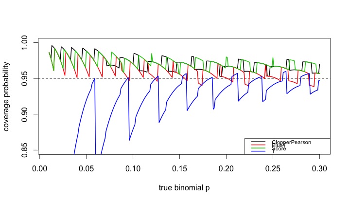
In this entry, we demonstrate how the coverage varies as a function of the underlying probability and compare four intervals: (1) t interval, (2) Clopper-Pearson, (3) Plus4 (Wilson/Agresti/Coull) and (4) Score, using code contributed by Albyn Jones from Reed College. Here, coverage probability is defined as the expected value that a CI based on an observed value will cover the true binomial parameter that generated that value. The code calculates the coverage probability as a function of a given binomial probability p and a sample size n. Intervals are created for each of the possible outcomes from 0, ..., n, then checked to see if the intervals include the true value. Finally, the sum of the probabilities of observing outcomes in which the binomial parameter is included in the interval determines the exact coverage. Note several distinct probabilities: (1) binomial parameter "p", the probability of success on a trial; (2) probability of observing x successes in N trials, P(X=x); (3) coverage probability as defined above. For distribution quantiles and probabilities, see section 1.10 and table 1.1.

R

We begin by defining the support functions which will be used to calculate the coverage probabilities for a specific probability and sample size.

CICoverage = function(n, p, alpha=.05) {
# set up a table to hold the results
Cover = matrix(0, nrow=n+1, ncol=5)
colnames(Cover)=c("X","ClopperPearson","Plus4","Score","T")
Cover[,1]=0:n
zq = qnorm(1-alpha/2)
tq = qt(1-alpha/2,n-1)
for (i in 0:n) {
Phat = i/n
P4 = (i+2)/(n+4)
# Calculate T and plus4 intervals manually,
# use canned functions for the other
TInt = Phat + c(-1,1)*tq*sqrt(Phat*(1-Phat)/n)
P4Int = P4 + c(-1,1)*zq*sqrt(P4*(1-P4)/(n+4))
CPInt= binom.test(i,n)$conf.int
SInt = prop.test(i,n)$conf.int
# check to see if the binomial p is in each CI
Cover[i+1,2] = InInt(p, CPInt)
Cover[i+1,3] = InInt(p, P4Int)
Cover[i+1,4] = InInt(p, SInt)
Cover[i+1,5] = InInt(p, TInt)
}
# probability that X=x
p = dbinom(0:n, n, p)
ProbCover=rep(0, 4)
names(ProbCover) = c("ClopperPearson", "Plus4", "Score", "T")
# sum P(X=x) * I(p in CI from x)
for (i in 1:4){
ProbCover[i] = sum(p*Cover[,i+1])
}
list(n=n, p=p, Cover=Cover, PC=ProbCover)
}

In addition, we define a function to determine whether something is in the interval.

InInt = function(p,interval){
interval[1] <= p && interval[2] >= p
}

Finally, there's a function which summarizes the results.

CISummary = function(n, p) {
M = matrix(0,nrow=length(n)*length(p),ncol=6)
colnames(M) = c("n","p","ClopperPearson","Plus4","Score","T")
k=0
for (N in n) {
for (P in p) {
k=k+1
M[k,]=c(N, P, CICoverage(N, P)$PC)
}
}
data.frame(M)
}

We then generate the CI coverage plot provided at the start of the entry, which uses sample size n=50 across a variety of probabilities.

lwdval = 2
nvals = 50
probvals = seq(.01, .30, by=.001)
results = CISummary(nvals, probvals)
plot(range(probvals), c(0.85, 1), type="n", xlab="true binomial p",
ylab="coverage probability")
abline(h=0.95, lty=2)
lines(results$p, results$ClopperPearson, col=1, lwd=lwdval)
lines(results$p, results$Plus4, col=2, lwd=lwdval)
lines(results$p, results$Score, col=3, lwd=lwdval)
lines(results$p, results$T, col=4, lwd=lwdval)
tests = c("ClopperPearson", "Plus4", "Score", "T")
legend("bottomright", legend=tests,
col=1:4, lwd=lwdval, cex=0.70)

The resulting plot is quite interesting, and demonstrates how non-linear the coverage is for these methods, and how the t (almost equivalent to the normal, in this case) is anti-conservative in many cases. It also confirms the results of Agresti and Coull, who concluded that for interval estimation of a proportion, coverage probabilities from inverting the standard binomial and too small when inverting the Wald large-sample normal test, with the Plus 4 yielding coverage probabilities close to the desired, even for very small sample sizes.

SAS
Calculating the coverage probability for a given N and binomial p can be done in a single data step, summing the probability-weighted coverage indicators over the realized values of the random variate. Once this machinery is developed, we can call it repeatedly, using a macro, to find the results for different binomial p. We comment on the code internally.

%macro onep(n=,p=,alpha=.05);
data onep;
n = &n;
p = &p;
alpha = α
/* set up collectors of the weighted coverage indicators */
expcontrib_t = 0;
expcontrib_p4 = 0;
expcontrib_s = 0;
expcontrib_cp = 0;
/* loop through the possible observed successes x*/
do x = 0 to n;
probobs = pdf('BINOM',x,p,n); /* probability X=x */
phat = x/n;
zquant = quantile('NORMAl', 1 - alpha/2, 0, 1);
p4 = (x+2)/(n + 4);

/* calculate the half-width of the t and plus4 intervals */
thalf = quantile('T', 1 - alpha/2,(n-1)) * sqrt(phat*(1-phat)/n);
p4half = zquant * sqrt(p4*(1-p4)/(n+4));

/* the score CI in R uses a Yates correction by default, and is
reproduced here */
yates = min(0.5, abs(x - (n*p)));
z22n = (zquant**2)/(2*n);
yl = phat-yates/n;
yu = phat+yates/n;
slower = (yl + z22n - zquant * sqrt( (yl*(1-yl)/n) + z22n / (2*n) )) /
(1 + 2 * z22n);
supper = (yu + z22n + zquant * sqrt( (yu*(1-yu)/n) + z22n / (2*n) )) /
(1 + 2 * z22n);

/* cover = 1 if in the CI, 0 else */
cover_t = ((phat - thalf) < p) and ((phat + thalf) > p);
cover_p4 = ((p4 - p4half) < p) and ((p4 + p4half) > p);
cover_s = (slower < p) and (supper > p);
/* the Clopper-Pearson interval can be easily calculated on the fly */
cover_cp = (quantile('BETA', alpha/2 ,x,n-x+1) < p) and
(quantile('BETA', 1 - alpha/2 ,x+1,n-x) > p);

/* cumulate the weighted probabilities */
expcontrib_t = expcontrib_t + probobs * cover_t;
expcontrib_p4 = expcontrib_p4 + probobs * cover_p4;
expcontrib_s = expcontrib_s + probobs * cover_s;
expcontrib_cp = expcontrib_cp + probobs * cover_cp;
/* only save the last interation */
if x = N then output;
end;
run;
%mend onep;

The following macro calls the first one for a series of binomial p for a fixed N. Since the macro %do loop can only iterate through integers, we have to do a little division; the %sysevelf function will do this within the macro.

%macro repcicov(n=, lop=, hip=, byp=, alpha= .05);
/* need an empty data set to store the results */
data summ; set _null_; run;
%do stepp = %sysevalf(&lop / &byp, floor) %to %sysevalf(&hip / &byp,floor);
/* note that the p sent to the %onep macro is a
text string like "49 * .001" */
%onep(n = &n, p = &stepp * &byp, alpha = &alpha);
/* tack on the current results to the ones finished so far */
/* this is a simple but inefficient way to add each binomial p into
the output data set */
data summ; set summ onep; run;
%end;
%mend repcicov;

/* same parameters as in R */
%repcicov(n=50, lop = .01, hip = .3, byp = .001);

Finally, we can plot the results. One option shown here and not mentioned in the book are the mode=include option to the symbol statement, which allows the two distinct pieces of the T coverage to display correctly.

goptions reset=all;
legend1 label=none position=(bottom right inside)
mode=share across=1 frame value = (h=2);
axis1 order = (0.85 to 1 by 0.05) minor=none
label = (a=90 h=2 "Coverage probability") value=(h=2);
axis2 order = (0 to 0.3 by 0.05) minor=none
label = (h=2 "True binomial p") value=(h=2);
symbol1 i = j v = none l =1 w=3 c=blue mode=include;
symbol2 i = j v = none l =1 w=3 c=red;
symbol3 i = j v = none l =1 w=3 c=lightgreen;
symbol4 i = j v = none l =1 w=3 c=black;
proc gplot data = summ;
plot (expcontrib_t expcontrib_p4 expcontrib_s expcontrib_cp) * p
/ overlay legend vaxis = axis1 haxis = axis2 vref = 0.95 legend = legend1;
label expcontrib_t = "T approximation" expcontrib_p4 = "P4 method"
expcontrib_s = "Score method" expcontrib_cp = "Exact (CP)";
run; quit;


An unrelated note about aggregators:We love aggregators! Aggregators collect blogs that have similar coverage for the convenience of readers, and for blog authors they offer a way to reach new audiences. SAS and R is aggregated by R-bloggers, PROC-X, and statsblogs with our permission, and by at least 2 other aggregating services which have never contacted us. If you read this on an aggregator that does not credit the blogs it incorporates, please come visit us at SAS and R. We answer comments there and offer direct subscriptions if you like our content. In addition, no one is allowed to profit by this work under our license; if you see advertisements on this page, the aggregator is violating the terms by which we publish our work.

Wednesday, January 11, 2012

Example 9.19: Demonstrating the central limit theorem


A colleague recently asked "why should the average get closer to the mean when we increase the sample size?" We should interpret this question as asking why the standard error of the mean gets smaller as n increases. The central limit theorem shows that (under certain conditions, of course) the standard error must do this, and that the mean approaches a normal distribution. But the question was why does it? This seems so natural that it may have gone unquestioned in the past.

The best simple rationale may be that there are more ways to get middle values than extreme values--for example, the mean of a die roll (uniform discrete distribution on 1, 2, ..., 6) is 3.5. With one die, you're equally likely to get an "average" of 3 or of 1. But with two dice there are five ways to get an average of 3, and only one way to get an average of 1. You're 5 times more likely to get the value that's closer to the mean than the one that's further away.

Here's a simple graphic to show that the standard error decreases with increasing n.


SAS
We begin by simulating some data-- normal, here, but of course that doesn't matter (assuming that the standard deviation exists for whatever distribution we pick and the sample size is appropriately large). Rather than simulate separate samples with n = 1 ... k, it's easier to add a random variate to a series and keep a running tally of the mean, which is easy with a little algebra. This approach also allows tracking the progress of the mean of each series, which could also be useful.


%let nsamp = 100;
data normal;
do sample = 1 to &nsamp;
meanx = 0;
do obs = 1 to &nsamp;
x = normal(0);
meanx = ((meanx * (obs -1)) + x)/obs;
output;
end;
end;
run;

We can now plot the means vs. the number of observations.

symbol1 i = none v = dot h = .2;
proc gplot data = normal;
plot meanx * obs;
run;
quit;

symbol1 i=join v=none r=&nsamp;
proc gplot data=normal;
plot meanx * obs = sample / nolegend;
run; quit;

The graphic resulting from the first proc gplot is shown above, and demonstrates both how quickly the variability of the estimate of the mean decreases when n is small, and how little it changes when n is larger. A plot showing the means for each sequence converging can be generated with the second block of code. Note the use of the global macro variable nsamp assigned using the %let statement (section A.8.2).

R
We'll also generate sequences of variates in R. We'll do this by putting the random variates in a matrix, and treating each row as a sequence. We'll use the apply() function (sections 1.10.6 and B.5.3) to treat each row of the matrix separately.

numsim = 100
matx = matrix(rnorm(numsim^2), nrow=numsim)

runavg = function(x) { cumsum(x)/(1:length(x)) }
ramatx = t(apply(matx, 1, runavg))

The simple function runavg() calculates the running average of a vector and returns the a vector of equal length. By using it as the function in apply() we can get the running average of each row. The result must be transposed (with the t() function, section 1.9.2) to keep the sequences in rows. To plot the values, we'll use the type="n" option to plot(), specifying the first column of the running total as the y variable. While it's possible that the running average will surpass the average when n=1, we ignore that case in this simple demonstration.

plot(x=1:numsim, y = ramatx[,1], type="n",
xlab="number of observations", ylab="running mean")
rapoints = function(x) points(x~seq(1:length(x)), pch=20, cex=0.2)
apply(ramatx,1,rapoints)

plot(x=1:numsim, y = ramatx[,1], type="n",
xlab="number of observations", ylab="running mean")
ralines = function(x) lines(x~seq(1:length(x)))
apply(ramatx, 1, ralines)

Here we define another simple function to plot the values in a vector against the place number, then again use the apply() function to plot each row as a vector. The first set of code generates a plot resembling the SAS graphic presented above. The second set of code will connect the values in each sequence, with results shown below.

Tuesday, October 25, 2011

Example 9.11: Employment plot


A facebook friend posted the picture reproduced above-- it makes the case that President Obama has been a successful creator of jobs, and also paints GW Bush as a president who lost jobs. Another friend pointed out that to be fair, all of Bush's presidency ought to be included. Let's make a fair plot of job growth and loss. Data can be retrieved from the Bureau of Labor Statistics, where Nick will be spending his next sabbatical. The extract we use below is also available from the book website. This particular table reports the cumulative change over the past three months, adjusting for seasonal trends. This tends to smooth out the line.

SAS

The first job is to get the data into SAS. Here we demonstrate reading it directly from a URL, as outlined in section 1.1.6.

filename myurl
url "http://www.math.smith.edu/sasr/datasets/bls.csv";

data q_change;
infile myurl delimiter=',';
input Year Jan Feb Mar Apr May Jun Jul Aug Sep Oct Nov Dec Annual;
run;

The raw data are in a pretty inconvenient format for plotting. To make a long, narrow data set with a row for each month, we'll use proc transpose (section 1.5.3) to flip each year on its side. Then, to attach a date to each measure, we'll use the compress function. First we add "01" (the first of the month) to the month name, which is in a variable created by proc transpose with the default name "_name_". Then we tack on the year variable, and input the string in the date format. The resulting variable is a SAS date (number of days since 12/31/1959, see section 1.6.1).

proc transpose data=q_change out=q2;
by year;
run;

data q3;
set q2;
date1 = input(compress("01"||_name_||year),date11.);
run;

Now the data are ready to plot. It would probably be possible to use proc sgplot but proc gplot is more flexible and allows better control for presentation graphics.

title "3-month change in private-sector jobs, seasonally adjusted";
axis1 minor = none label = (h=2 angle = 90 "Thousands of jobs")
value = (h = 2);
axis2 minor = none value = (h=2)label = none
offset = (1cm, -5cm)
reflabel = (h=1.5 "Truman" "Eisenhower" "Kennedy/Johnson"
"Nixon/Ford" "Carter" "Reagan" "GHW Bush" "Clinton" "GW Bush" "Obama" );
symbol1 i=j v=none w=3;

proc gplot data=q3;
plot col1 * date1 / vaxis=axis1 haxis=axis2 vref=0
href = '12apr1945'd '21jan1953'd '20jan1961'd '20jan1969'd
'20jan1977'd '21jan1981'd '20jan1989'd '20jan1993'd
'20jan2001'd '20jan2009'd;
format date1 monyy6.;
run;
quit;

Much of the syntax above has been demonstrated in our book examples and blog entries. What may be unfamiliar is the use of the href option in the plot statement and the reflabel option in the axis statement. The former draws reference lines at the listed values in the plot, while the latter adds titles to these lines. The resulting plot is shown here.

Looking fairly across postwar presidencies, only the Kennedy/Johnson and Clinton years were mostly unmarred by periods with large losses in jobs. The Carter years were also times jobs were consistently added. While the graphic shared on facebook overstates the case against GW Bush, it fairly shows Obama as a job creator thus far, to the extent a president can be credited with jobs created on his watch.


R

The main trick in R is loading the data and getting it into the correct format.
here we use cbind() to grab the appropriate columns, then transpose that matrix and turn it into a vector which serves as input for making a time series object with the ts() command (as in section 4.2.8). Once this is created, the default plot for a time series object is close to what we have in mind.

ds = read.csv("http://www.math.smith.edu/sasr/datasets/bls.csv",
header=FALSE)
jobs = with(ds, cbind(V2, V3, V4, V5, V6, V7, V8, V9, V10,
V11, V12, V13))
jobsts = ts(as.vector(t(jobs)), start=c(1945, 1),
frequency=12)
plot(jobsts, plot.type="single", col=4,
ylab="number of jobs (in thousands)")

All that remains is to add the reference lines for 0 jobs and the presidencies. The lines are most easily added with the abline() function (section 5.2.1). Easier than adding labels for the lines within the plot function will be to use the mtext() function to place the labels in the margins. We'll write a little function to save a few keystrokes by plotting the line and adding the label together.

abline(h=0)
presline = function(date,line,name){
mtext(at=date,text= name, line=line)
abline(v = date)
}
presline(1946,1,"Truman")
presline(1953,2,"Eisenhower")
presline(1961,1,"Kennedy/Johnson")
presline(1969,2,"Nixon/Ford")
presline(1977,1,"Carter")
presline(1981,2,"Reagan")
presline(1989,1,"GHW Bush")
presline(1993,2,"Clinton")
presline(2001,1,"GW Bush")
presline(2009,2,"Obama")

It might be worthwhile to standardize the number of jobs to the population size, since the dramatic loss of jobs due to demobilization after the Second World War during a single month in 1945 (2.4 million) represented 1.7% of the population, while the recent loss of 2.3 million jobs in 2009 represented only 0.8% of the population.