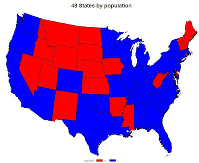
In our book, we show a simple example of a map (section 6.4.2) where we read the boundary files as data sets and use SAS and R to plot them. But both SAS and R have complex functionality for using pre-compiled map data. To demonstrate them, we'll show how to make a simple choropleth map, using US Census data available here. The file also includes data on the whole country, and by region, which may complicate use.
One feature of maps of large areas is that in representing the surface of the earth in two dimensions, they necessarily involve some distortion. Cartographers use "projections" to specify how the globe should be represented.
SAS
We first read the data from the URL mentioned above (section 1.1.6). Note that the file is rather wide, and SAS fails to read all the variable names. We then create a new variable indicating whether the state had a population above or below 3,000,000 in 2000.
filename census url
"http://www.census.gov/popest/national/files/NST_EST2009_ALLDATA.csv";

proc import datafile=census out=ds dbms=csv replace;
getnames=yes;
guessingrows = 58;
run;

data cpop;
set ds;
pop3mill = (census2000pop > 3000000);
run;
SAS/GRAPH comes with many map data sets; they are installed in the maps directory. The "states" data set has the boundaries of all 50 states and Washington, D.C. But plotting Alaska and Hawaii is a hassle that's beyond our scope today, so we drop them. We also don't need especially fine resolution. By selecting density < 4 we can reduce the size of the map data set by a factor of 5.
data us48;
   set maps.states;
   if (state ne 2) and (state ne 15) and (state ne 72);
   if density < 4;
run;
The gproject procedure takes a map stored as latitude and longitude, and projects it into x and y values for plotting. The list of available projections is somewhat overwhelming, and we arbitrarily picked one available in R. SAS will choose convenient projection parameters for you (the parallels, in this case) by default, but to ensure the same results as when using R, we set them to some nice round numbers.
proc gproject data=us48 out=us48proj
  parallel1 = 35 parallel2=50;
  id state;
run;
Now we're ready to run proc gmap. Both the SAS map data set and the Census data set included a state ID number that happened to mean the same thing. This is used in the id statement and links the regions in the map data to those in the data data set. Note here that the choro statement will accept a continuous variable and will divide it into groups for you using the /nlevels= option in the choro statement, but the finer control of creating your own cutpoints is useful.
title "48 States by population";
pattern1 c=red;
pattern2 c=blue;
proc gmap map=us48proj data=cpop all;
   id state;
   choro pop3mill;
run; quit;
The results are shown above.
R
There are several R packages that support mapping. Here we use the maps and mapproj packages. The maps package includes both functions and map data sets. First, we read in the data from the Census. Then we select out the state names and the population in 2000, changing the state names to a character, from a factor object. We also make a vector with colors corresponding to the size of the state. We used the RColorBrewer package in Example 8.13, and that would be a fine tool to use here for more categories of the population size.
statepopdata <- read.csv(
 "http://www.census.gov/popest/national/files/NST_EST2009_ALLDATA.csv")
popnames = as.character(statepopdata$NAME)
pop2000 = statepopdata$CENSUS2000POP
popdich = ifelse(pop2000 < 3000000, "red", "blue")
The data() function makes the state map file available. The names of the regions in the map can be extracted using the map() function; we'll need those to link to the population data.
library(maps)
library(mapproj)
data(state)
mapnames = map("state", plot=FALSE)$names
The regions in the map file include separate names for some islands and other disconnected regions. These have the format state:region and we need to drop the colon and remainder, if present. We can do that with a complex application of the regexpr() function (section 1.4.6). First we test for the presence of a colon. If it isn't there, we return the name of the state. If it is there, we use the substr() function (section 1.4.7) to clip the colon and remainder. Finally, since the names are recorded in lower case in the map, we'll convert the population data set's name to lower also (section 1.4.8).
mapnames.state = ifelse(regexpr(":",mapnames) < 0,
  mapnames, substr(mapnames, 1, regexpr(":",mapnames)-1))
popnames.lower = tolower(popnames)
Now we can make a color vector that copies the colors for each state into the possibly multiple regions the map includes for each state. We do this using the match() function, which returns the positions of the first argument in its second argument. Called as the index of the dichotomous indicator we made above, it will replicate the color for Michigan in the population data to both the upper and lower peninsulas of Michigan. Pretty cool! Also, since Puerto Rico, Alaska, and Hawaii don't appear in the map names vector, their population plot colors are not used. Then the choropleth is easily made with the map() function. The (many, many) projections available through the mapproj library can be found in the help for the mappropject() function.
cols= popdich[match(mapnames.state,popnames.lower)]
map("state",fill=TRUE,col=cols,proj="albers",param=c(35,50))
title("48 States by population")
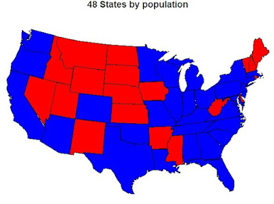
The results are found below. In general, the states of the western interior are not as populous.

1 comment:
Lately I have been studying mapping using SAS, JMP, and Tableau. The latter is the easiest, but SAS is fine as well, if one has time to do much trial & error. I am studying your R example and I like it, but the big question I have now is doing county level maps. Do you know any good reference work using R for county level maps? Also overlays - a quick example might be overlaying disease prevalence with a population density, with perhaps bubbles of medical facilities?
Post a Comment