SAS
For SAS, we have to make two separate variables-- one with the CESD for the females, and another for the males. For the other gender, these gender-specific variables will have missing values. We'll do this using conditioning (section 1.11.2).
libname k "c:\book";

data twocolors;
set k.help;
  if female eq 1 then femalecesd = cesd;
  else malecesd = cesd;
run;
Now we can use the bubble2 statement (close kin of the plot2 statement, section 5.1.2) to add both gender-specific variables to the plot. While we're at it, we relabel the x-axis to no longer be gender specific and specify that the right y-axis is not to be labeled.
proc gplot data = twocolors;
bubble malecesd*age=i1 / bscale = radius bsize=200
                           bcolor = blue bfill = solid;
bubble2 femalecesd*age=i1 / bscale = radius bsize = 200
                           bcolor = pink bfill = solid noaxis;
label malecesd="CESD";
run;
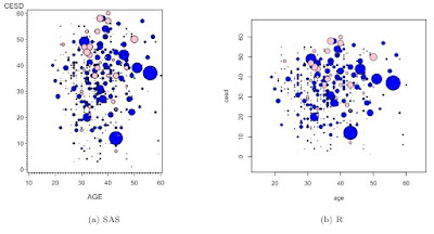
As in the previous bubble plot example, the scale is manipulated arbitrarily so that the SAS and R figures are similar.
We're somewhat fortunate here that the range of the two gendered CESD scores are similar
R
In the comments for Example 7.28, we suggested the following simple R code.
load(url("http://www.math.smith.edu/sasr/datasets/savedfile"))
femalealc = subset(ds, female==1 & substance=="alcohol")
malealc = subset(ds, female==0 & substance=="alcohol")
with(malealc, symbols(age, cesd, circles=i1,
inches=1/5, bg="blue"))
with(femalealc, symbols(age, cesd, circles=i1,
inches=1/5, bg="pink", add=TRUE))
While this does generate a plot, it could be misleading, in that the scale of the circle sizes is relative to the largest value within each symbols() call. While this could be desirable, it's more likely that we'd like a single scale for the circles. R code for this can be made in a single statement:
load(url("http://www.math.smith.edu/sasr/datasets/savedfile"))
attach(ds)
symbols(age, cesd, circles=i1,inches=1/5,
             bg=ifelse(female==1,"pink","blue"))
Here the ifelse() function (section 1.11.2) generates a different circle fill color depending on the value of female.
The resulting plots are shown below.

6 comments:
How could one extend the example to coloring by a fourth variable with more than two options? Is it also possible to combine it with adding bubble labels by a 5th variable?
Agree with previous comment, the fourth variable being limited to a cardinality of 2 in sas is hardly useful.
Please see example 8.5 (http://sas-and-r.blogspot.com/2010/09/example-85-bubble-plots-part-3.html) to see this done, folks. The sgplot prot procedure also does it trivially:
data test;
do i = 1 to 40;
cat = ceil(i/10);
x = normal(0) - cat;
y = x + normal(0);
size = normal(0);
output;
end;
run;
proc sgplot data = test;
bubble x=x y=y size=size / group=cat;
run;
quit;
This is great, thanks. Is there a way to restrict the Z value to limit outliers? All of my points are "significant" but even after log transforming I still have one or two points that are much larger than the others, dwarfing the majority of bubbles.
Thanks!
Hi Justin--
My first thought would be to handle this on a case-by-case basis, meaning to arbitrarily remove the large values by hand before plotting the data.
But it would be an interesting exercise to construct a function to detect range issues like this. You could also embed the R code in a function and include an option to trim the n largest values before plotting.
The latter was a great suggestion, I was actually able to embed it into a DESeq2 analysis co-opting the way that heatmaps are handle outlier issues and applying it to this. Thanks again.
Post a Comment