However, other means of presenting three dimensions on a flat screen or piece of paper often rely on visual cues regarding perspective, which some find difficult to judge.
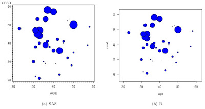
Here we demonstrate SAS and R bubble plots using the HELP data set used in our book. We show a plot of depression by age, with bubble size proportional to the average number of drinks per day. To make the plot a little easier to read, we show this only for female alcohol abusers.
SAS
In SAS, we can use the bubble statement in proc gplot. We demonstrate here the use of the where data set option (section 1.5.1) for subsetting, which allows us to avoid using any data steps. SAS allows the circle area or radius to be proportional to the third variable; we choose the radius for compatibility with R. We alter the size of the circles for the same reason. We also demonstrate options for coloring in the filled circles.
libname k "c:\book";

proc gplot data = k.help (where=((female eq 1)
                    and (substance eq "alcohol")));
bubble cesd*age=i1 / bscale = radius bsize=60
                           bcolor=blue bfill=solid;
run;
R
In R, we can use the symbols() function for the plot. Here we also demonstrate reading in data previously saved in native R format (section 1.1.1), as well as the subset() function and the with() function (the latter appears in section 1.3.1). The inches option is an arbitrary scale factor. We note that the symbols() function has a great deal of additional capability-- it can substitute squares for circles for plotting the third variable, and add additional dimensions with rectangles or stars. Proportions can be displayed with thermometers, and boxplots can also be displayed.
load(url("http://www.math.smith.edu/sasr/datasets/savedfile"))
femalealc = subset(ds, female==1 & substance=="alcohol")
with(femalealc, symbols(age, cesd, circles=i1,
                                 inches=1/5, bg="blue"))
The results are shown below. It appears that younger women with more depressive symptoms tend to report more drinking.

7 comments:
hi,
Is it possible to show colour variable for the Gender if its has MALE - with blue colour and FEMALE with Pink color
Thanks for writing, Anonymous.
Anything's possible. In R, it would be almost trivial, using the add=TRUE option in the symbols() call. Like this:
malealc = subset(ds, female==0 & substance=="alcohol")
with(malealc, symbols(age, cesd, circles=i1,
inches=1/5, bg="blue"))
with(femalealc, symbols(age, cesd, circles=i1,
inches=1/5, bg="pink", add=TRUE))
assuming you'd already made the femalealc data set. Or you could do it without the with() function by conditioning on female in separate calls to symbols().
In SAS, you can easily get different colors in scatterplots using the a*b=c syntax, but that's not available for bubble plots. Instead, you could trick SAS into doing it using the bubble2 statement, which plots an additional y variable vs. x. You'd have to do some data management, though.
Now, if you wanted 3 colors, it would still be trivial in R, but I think you'd be forced to draw each circle directly in SAS using an annotate data set. We'll consider doing this for a future post.
When "WARNING: File 'WORK.SASGOPT.CATALOG' is shorter than expected" is shown, which part of the program went wrong?
I am looking forward to the post about drawing each circle directly in SAS using annotate
Thanks for asking. I hadn't planned on actually doing it, but look for it in a blog post in late September.
Could someone please tell me, how could i give the label for circle size, in R.
Hello, Anonymous-- Happy to try to help, but I don't know what you're looking for. Can you describe it in more detail, please?
Post a Comment