SAS
In SAS, we add jitter, then plot the jittered values and the observed values on the same plot using the overlay option. We display the jittered values as dots and add a smoothed line through the real (not jittered) data without displaying their values using symbol statements (sections 5.2.2, 5.2.6).
And the resulting plot is:
data ds2;
set test;
yplot = ytest + uniform(0) * .2;
run;

symbol1 i = sm50s v = none c = black;
symbol2 i = none v = dot c = black;
proc gplot data = ds2;
plot (ytest yplot) * xtest / overlay;
run;
R
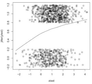
In R, we display a scatterplot (section 5.1.1) of the jittered values against the covariate. The jitter() function (section 5.2.4) is called within the plot() function. We then add the smoothed line, based on the real (not jittered) data using the lines() function (section 5.2.1), called with the appropriate lowess() (section 5.2.6) object as input.
plot(xtest,jitter(ytest))
lines(lowess(xtest,ytest))
And the resulting plot is:

These plots are useful, but fairly unattractive. In our next example, we'll make them prettier.

1 comment:
A reader asked why the two smoothed lines look so different. Two reasons: first, they're using different smoothers, and second, they use the simulated data generated in Example 7.2, which are different between the two programs.
Post a Comment