Small multiples are one of the great ideas of graphics visionary Edward Tufte (e.g., in Envisioning Information). Briefly, the idea is that if many variations on a theme are presented, differences quickly become apparent. Today we offer general guidance on creating figures with small multiples.
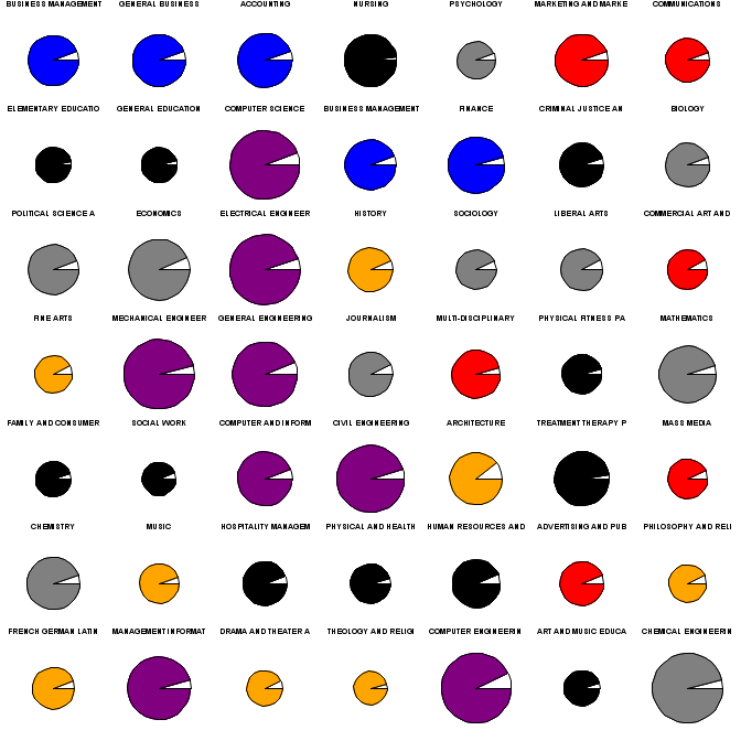
As an example, we'll show graphics for the popularity, salary, and unemployment rates for college majors. This data was discussed here where a scatterplot graphic was presented. We draw on data and code presented there as well. The scatterplot does not show the unemployment rate, and the width of the field names and arbitrarily sized text makes it difficult to determine the popularity ranking. In contrast, the small multiples plot, demonstrated above, makes each of these features easy to see. (Click on the picture for a clearer image.)
R
The graphics options in R, particularly par("mfrow") or par("mfcol"), are well-suited to small multiples. The main tip here is to minimize the space reserved for margins and titles. In the example below, we do this with the mar, mgp, and oma settings. We'll begin by setting up the data in a process that relies heavily on the code here. (Note that the zip file referred to includes data already in the R format-- since our point today is not data management, we don't replicate the process used to make this out of the raw data.)
clean = function(x) as.numeric(gsub("\\$|, ", "", x))
clean2 = function(x) as.numeric(gsub("%", "", x))
load("table.rda")
X[,2] = clean2(X[,2])
for (i in 3:5) X[,i] = clean(X[,i])


X$cols = NA
X$cols[grep("BUSI|ACC|FINAN",X[,1])] = 1
X$cols[grep("ENGINEERING",X[,1])] = 2
X$cols[grep("STAT|COMPU",X[,1])] = 3
X$cols[grep("BIOL|CHEMI|PHYSICS|MATHEM",X[,1])] =  4
X$cols[grep("ENGLISH|HISTORY|LANG|FINE|MUSIC|PHILOS|DRAMA|LIBERAL|ARCH|THEO",X[,1])] = 5
X$cols[grep("SOCIO|PSYCH|POLI|ECONO|JOURNAL",X[,1])] = 6
X$cols[grep("COMMUN|MARKET|COMMER|MULTI|MASS|ADVERT",X[,1])] = 7
X$cols[grep("NURS|CRIM|EDU|PHYSICAL|FAMI|SOCIAL|TREAT|HOSP|HUMAN",X[,1])] = 8
This removes some funny characters and groups the fields together in a coherent manner. Then we write a function to set the par() values we need to change, and plot a pie for each row of the data set. Here a for loop is used-- we're not aware of a vectorized version of the pie() function. Colors for each pie are assigned via the colors.
sortx = X[order(X$Popularity),]

smajors = function(mt) {
  old.par = par(no.readonly=TRUE)
  on.exit(par(old.par))
  nrows = sqrt(nrow(mt)) + (ceiling(sqrt(nrow(mt))) !=  sqrt(nrow(mt)))
  par(mfrow=c(nrows,nrows), mar=c(1,0,0,0), oma=c(0,0,0,0), mgp=c(0,0,0))
  colors = c("blue", "purple", "purple", "gray", "orange", "gray", "red", "black")
  for (i in 1:nrow(mt)) {
    pie(c(mt[i,2], 100 - mt[i,2]), labels=NA, radius=mt[i,4]/max(mt[,4]),
        col = c("white",colors[mt[i,7]]))
    mtext(substr(mt[i,1],1,19), side=1, cex=.8)
  }
}

smajors(sortx[1:49,])
The resulting plot is shown above. There may be too many colors, though statistics and computing were assigned the same color as engineering. We can easily read from the plot that computing, statistics, and engineering (purple) are the largest circles, and thus the best paying. Similarly, the humanities (orange) are the worst paying. They are also not terribly popular-- the first orange pie appears in the second row. The "professions" (nursing, teaching, policing, therapy) don't pay well but are fairly popular. Most pies have roughly equal unemployment, though nursing and the professions generally are notable for near full employment. All in all, the rank, salary, unemployment percentage, and field are all clearer than in the scatterplot.
SAS
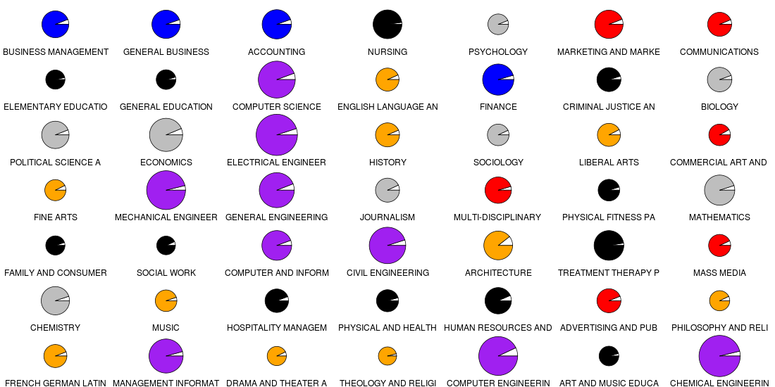
In SAS, one can use the greplay procedure to reproduce images in miniature. One has to define the size and shape allotted for each replayed plot, in a stored "template." This allows enormous control, but at the cost of some complexity. For example, one can create a scatterplot matrix using proc gplot instead of proc sgplot, as in this implementation by Michael Friendly. If you can generate your multiple images with a by statement, the coding for this is not too painful. However, in this case, it was not obvious how to change the color and radius for each pie using a by statement in proc gchart which includes pie charts, and would thus have been the obvious choice. In such cases, it may be easier to plot the figures directly using an annotate data set.
However, having demonstrated the use of annotate previously (e.g., Example 8.13), we show here an application using greplay, though the coding is a little bit involved. In outline, we use a macro to call for a pie to be made from each observation of the original data set. Then we use a template-making macro found here to generate the 7X7 grid template. Finally, we replay the pies into the grid.
/* read the data-- note that text file edited to remove spaces in
    variable names */
proc import datafile =
   'c:\sas-r dictionary\p\book\web\blog\majors\majors\table.txt'
   out = majors;
   getnames = yes;
   run;

/* set up the field categories and colors */
data m2;
set majors;
cols="      ";     /* make a missing character variable to hold them */
mf = majorfield;   /* just a copy to save keystrokes */
   /* the find() function is discussed in section 1.4.6 */
if sum(find(mf,"BUSI"), find(mf,"ACC"), find(mf,"FINAN")) ne 0 then cols = "blue";
if find(mf,"ENGINEERING") ne 0 the cols = "purple";
if sum(find(mf,"STAT"), find(mf,"COMPU"), find(mf,"SYSTEMS")) ne 0 then cols = "purple";
if sum(find(mf,"BIOL"), find(mf,"CHEMI"), find(mf,"PHYSICS"), find(mf,"MATH")) ne 0 then cols = "gray";
if sum(find(mf,"ENGL"), find(mf,"HIST"), find(mf,"FRENCH"), find(mf,"FINE"),
     find(mf,"MUSIC"), find(mf,"PHIL"), find(mf,"DRAMA"), find(mf,"LIBERAL"),
     find(mf,"ARCH"), find(mf,"THEO")) ne 0 then cols = "orange";
if sum(find(mf,"SOCI"), find(mf,"PSYCH"), find(mf,"POLI"), find(mf,"ECON"),
     find(mf,"JOURN"), find(mf,"LIBERAL")) ne 0 then cols = "gray";
if sum(find(mf,"COMMU"), find(mf,"MARKET"), find(mf,"COMMER"), find(mf,"MULTI"),
     find(mf,"MASS"), find(mf,"ADVERT")) ne 0 then cols = "red";
if sum(find(mf,"NURS"), find(mf,"CRIM"), find(mf,"EDU"), find(mf,"PHYSICAL"),
     find(mf,"FAMI"), find(mf,"SOCIAL"), find(mf,"TREAT"),
     find(mf,"HOSP"), find(mf,"HUMAN")) ne 0 then cols = "black";
drop MF;   /* get rid of that keystroke-saver */
run;

/* order by popularity */
proc sort data = m2; by popularity; run;
The next macro takes a line number as input. A data step then reads that line from the real data set and uses call symput (section A.8.2) to extract as macro variables the median earnings used for the radius, the color, and the major name. It then produces two rows of data-- one with the unemployed percent and the other with the employed percent. We need this for the proc gchart input, as shown in the second half of the macro.
%macro smpie(obs);
data t1;
set m2 (firstobs = &obs obs = &obs);
call symput('rm', medianearnings);
call symput('color', cols);
call symput('name', strip(substr(majorfield,1,19)));
employed = "No"; percent = unemploymentpercent; output;
employed = "Yes"; percent = 100 - unemploymentpercent; output;
run;

pattern1 color= white v=solid;
pattern2 color= &color v=solid;  /* only pattern2 should be needed, I think, but */
pattern3 color= &color v=solid;  /* sometimes SAS required pattern3, in my trials */
title h=7pct "&name";
proc gchart data = t1 gout = kkpies;
pie percent / group = majorfield sumvar = percent value = none
    noheading nogroupheading radius = %sysevalf((&rm * 45)/ 105000)
    name = "PIE&obs" ;
run;quit;
%mend smpie;
Of particular note in the forgoing are the gout and name options. The former specifies a location where output plots should be stored. The latter assigns a name to this particular plot. In addition, the %sysevalf macro function is needed to perform mathematical functions on the radius variable.
Next, we write and call another macro to call the first repeatedly. Making the image small to begin with (using the goptions statement [section 5.3]) reduces quality loss when replaying as small multiples.
%macro pies;
goptions hsize=1in vsize=1in;
%do i = 1 %to 49;
  %smpie(&i);
%end;
%mend;

%pies;
Finally, we can make the template to replay the images, and replay them, both using proc greplay.
/* key elements of the %makegridtemplate macro:
     how many rows and columns (down and across).
     name for the template.
   Note that the macro is called *inside* the proc greplay statement,
   which allows the user access to  pro greplay statment options */
proc greplay nofs  tc=work.templates;
  %makeGridTemplate (across=7, down=7, ordering=LRTB,
      hgap=0, vgap=0, gapT=0, gapL=0, gapr=0, name=sevensq,bordercolor=white)
quit;

/* this macro just types out text for us the sequence 1:pie1 2:pie2 ... 49:pie49 */
/* we need that to replay the figures in proc greplay */
%macro pielist;
%do i = 1 %to 49; &i:pie&i %end;;
%mend;

filename pies "c:\temp\pies2.png";
goptions hsize=7in vsize=7in gsfname=pies device=png;

/* now ready to replay the plots
   The proc greplay options say what template to use and where to find it,
     and where to find the input and place the output */
/* The treplay statement plays the old plots to the locations specified
     in the template
proc greplay template=sevensq tc=work.templates nofs gout=kkpies igout=kkpies;
treplay %pielist;
run;
quit;
The net outcome of this is shown below. The image is pretty disappointing-- the circles are not round,and the text is pretty blurry. However, the message is as clear as in the prettier R version.