Monday, August 31, 2009

Example 7.11: Plot an empirical cumulative distribution function from scratch

In example 7.8, we used built-in functions to produce an empirical CDF plot. But the empirical cumulative distribution function (CDF) is simple to calculate directly, and it might be useful to have more control over its appearance than is afforded by the direct method employed in example 7.8. In a later post, we'll use that control to improve upon example 7.8.

SAS

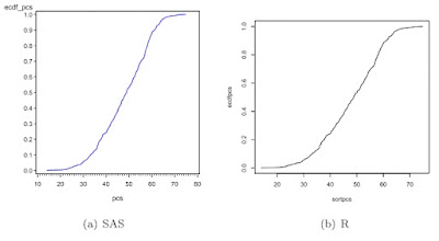
In SAS, we first read the data from a locally stored Stata data set. Then, we calculate the empirical CDF for pcs. We do this by first sorting (1.5.6) on pcs. Then the order statistic of the observation divided by the total number of obervations is the empirical probability that X ≤ x. We find the number of observations using the nobs data set option (A.6.1) and the observation number using the _n_ implied variable (1.4.15). Then we can plot the empirical CDF using proc gplot (section 5.1.1) to make a scatterplot and a symbol statement with the j interpolation (as in section 1.13.5) to connect the points.


proc import datafile="C:\book\help.dta"
out=help dbms=dta;
run;

proc sort data=help;
by pcs;
run;

data help_a;
set help nobs=totalobs;
ecdf_pcs = _n_ / totalobs;
run;

symbol1 i=j v=none c=blue;
proc gplot data=help_a;
plot ecdf_pcs * pcs;
run;
quit;


R
Now, R. First, make the ECDF values in a similar fashion to SAS, then make an empty frame (5.1.1), then fill the frame with lines connecting the calculated values (5.2.1).


library(foreign)
ds <- read.dta
("http://www.math.smith.edu/sasr/datasets/help.dta")
attach(ds)
sortpcs <- sort(pcs)
ecdfpcs <- (1:length(sortpcs))/length(sortpcs)
plot(sortpcs, ecdfpcs, type="n")
lines(sortpcs, ecdfpcs)

Monday, August 24, 2009

packages and CRANtastic

Additional functionality in R is added through packages, which consist of libraries of bundled functions, datasets, examples and help files that can be downloaded from CRAN (the Comprehensive R Archive Network). The function install.packages() or the windowing interface under Packages and Data (Mac) or Packages (Windows) are used to download and install packages (see section B.6.1, p. 273).

As of August, 2009, there were 1,907 packages on CRAN, up from 1,705 in March 2009 (see here for the current list). While each of these has met a minimal standard for inclusion, it is important to keep in mind that packages within R are typically created by individuals or small groups, and not endorsed by the R core group. As a result, they do not necessarily undergo the same level of testing and quality assurance that the core R system does.

CRANtastic is a free, open-source web-application that allows users to search for, review and tag CRAN packages. It was created by Hadley Wickham and is currently being developed by Bjørn Mæland. It can help you learn more about a package than it's inclusion on CRAN allows.

As an example, consider the entry for the plyr package. This is a set of tools written by Hadley that solves a common set of problems: you need to break a big problem down into manageable pieces, operate on each pieces and then put all the pieces back together. For example, you might want to fit a model to each spatial location or time point in your study, summarise data by panels or collapse high-dimensional arrays to simpler summary statistics. The CRANtastic entry provides detailed release information, author and maintainer, mentions that (as of August 23, 2009) 7 people have noted that they use it, lists 4 ratings received overall (5 stars), with 3 ratings for documentation (5 stars). A user named eamani provided a review. A search for related packages, dependencies and reverse depends is also included.

While still new, with relatively few users, this website has great potential to help provide some guidance about packages. If it takes off as an active community, this could help provide a map to particularly useful routines to utilize within R.

Thursday, August 13, 2009

Example 7.10: Get data from R into SAS

In our previous entry, we described how to generate a dataset from SAS that could be used for analyses in R. Alternatively, someone primarily using R might want to test the new ”statistical graphics” procedures available starting with SAS 9.2. Here we show how one might create a long data set in R, export it, read it in SAS, and generate a plot similar to that shown in example 7.9.

R

In R, we use the reshape() function (section 1.5.3) to make the ”long” data set. We make a data frame (section B.4.5) from the data we’ll need in SAS. We check the data, using the order() function (section 1.5.6) to organize the new data frame by subject instead of visit number. Finally, we write out the data set in dBase format (section 1.2.2).


> ds <- read.csv
("http://www.math.smith.edu/sasr/datasets/helpmiss.csv")
> attach(ds)
> long <- reshape(ds, idvar="id",
varying=list(c("cesd1","cesd2","cesd3","cesd4")),
v.names="cesdtv", timevar="visit", direction="long")
> attach(long)
> tosas <- data.frame(id, visit, cesdtv)
> head(tosas[order(id, visit),])

id visit cesdtv
1 1 1 7
471 1 2 NA
941 1 3 8
1411 1 4 5
2 2 1 11
472 2 2 NA

> library(foreign)
> write.dbf(tosas,"c:\\book\\tosas.dbf")


SAS
In SAS, we read in the data from the dBase format file (section 1.1.5), proc sort (section 1.5.6) it in place, and check the data using proc print(section 1.2.4).


proc import datafile="C:\book\tosas.dbf"
out=fromr dbms=dbf;
run;

proc sort data=fromr; by id visit; run;

proc print data=fromr (obs=5); run;

Obs id visit cesdtv

1 1 1 7
2 1 2 .
3 1 3 8
4 1 4 5
5 2 1 11


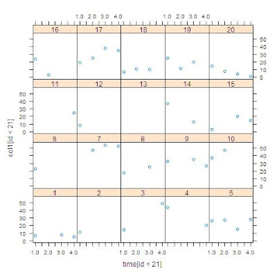
Finally, we generate the desired plot with proc sgpanel (section 5.1.11), using the where statement (section A.6.3) to select the first 20 subjects.


proc sgpanel data=fromr;
where id le 20;
panelby id / rows=4 columns=5;
scatter x=visit y=cesdtv;
run;


Saturday, August 8, 2009

Example 7.9: Get data from SAS into R

Some people use both SAS and R in their daily work. They might be more familiar with SAS as a tool for manipulating data and R preferable for plotting purposes. While our goal in the book is to enable people to avoid having to switch back and forth, the following example shows how to move data from SAS into R. Our use of Stata format as an interchange mechanism is perhaps unorthodox, but eminently workable. Other file formats (see section 1.2.2, creating files for use by other packages) can also be specified.

Suppose we wanted to plot CESD over time for each individual. While we show how to do this sort of thing in SAS (see section 5.6.2), it’s hard to do without SAS version 9.2. Instead, we recall it’s easy using the lattice library in R (see section 5.2.2). But we need a ”long” data set with a row for each time point. This is the sort of data management one might prefer to do in SAS.

SAS

First, we read the data from a data set stored in SAS format. Then we use proc transpose (section 1.5.3) to get the data into the required shape. Finally, we save the ”long” data set in Stata format (1.2.2).


libname k "c:\book";

proc transpose data=k.help out=ds1;
by id;
var cesd1 cesd2 cesd3 cesd4;
run;

proc print data = ds1 (obs = 5); run;

Obs ID _NAME_ _LABEL_ COL1

1 1 CESD1 1 cesd 7
2 1 CESD2 2 cesd .
3 1 CESD3 3 cesd 8
4 1 CESD4 4 cesd 5
5 2 CESD1 1 cesd 11


proc export data=ds1 (rename=(_label_=timec1))
outfile = "c:\book\helpfromsas.dta" dbms=dta;
run;


R
In R, we first read the file from Stata format (1.1.5), then attach() it (section 1.3.1) for ease of typing. Then we check the first few lines of data using the head() function (section 1.13.1). Noting that the time variable we brought from SAS is a character string, we convert it to a numeric variable using as.numeric() (section 1.4.2) and substr() (section 1.4.3). After loading the lattice library, we display the series for each subject. In this, we use the syntax for subsetting observations (1.5.1) to keep only the first 20 observations and the as.factor() function (1.4.10) to improve the labels in the output.


> library(foreign)
> xsas <- read.dta("C:\\book\\helpfromsas.dta")
> head(xsas)

id _name_ timec1 col1
1 1 CESD1 1 cesd 7
2 1 CESD2 2 cesd NA
3 1 CESD3 3 cesd 8
4 1 CESD4 4 cesd 5
5 2 CESD1 1 cesd 11
6 2 CESD2 2 cesd NA

> attach(xsas)
> time <- as.numeric(substr(timec1, 1, 1))
> library(lattice)
> xyplot(col1[id < 21] ~ time[id < 21]|as.factor(id[id < 21]))


In the next entry, we'll reverse this process to manipulate data in R and produce the plot in SAS.

Saturday, August 1, 2009

Example 7.8: Plot two empirical cumulative density functions using available tools

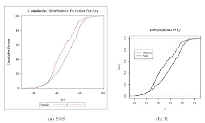
The empirical cumulative density function (CDF) (section 5.1.16) is a useful way to compare distributions between populations. The Kolmogorov-Smirnov (section 2.4.2) statistic D is the value of x with the maximum distance between the two curves. As an example, we compare the male and female distributions of pcs from the HELP data set described in the book. Here, we use built-in tools to plot the graph; in later entries we will build it from scratch for greater control.

We begin by reading in the data (section 1.1.14) as a comma separated file from the book web site (section 1.1.6).

SAS

filename myurl
url 'http://www.math.smith.edu/sasr/datasets/help.csv'
lrecl=704;

proc import
datafile=myurl out=ds dbms=dlm;
delimiter=',';
getnames=yes;
run;

SAS proc univariate can do this plot automatically (section 5.1.15). It is designed to compare two groups within the data set, using the class statement (section 3.1.3).


proc univariate data=ds;
var pcs;
class female;
cdfplot pcs / overlay;
run;


In R, the plot() function accepts ecdf() objects (section 5.1.15) as input. Applying this to pcs, conditional on including only the rows when female is 1 (section B.4.2) creates the first empirical CDF as well as the axes. The lines() function (section 5.2.1) also accepts ecdf() objects as input, and applying this to pcs when female is 0 adds the second empirical CDF to the existing plot. A legend (section 5.2.14) is added to show which curve is which. (Note that the Blogger software prevents displaying this image large enough to see the difference here, but it will be visible when run locally.

R

> ds <- read.csv(
"http://www.math.smith.edu/sasr/datasets/helpmiss.csv")
> attach(ds)
> plot(ecdf(pcs[female==1]), verticals=TRUE, pch=46)
> lines(ecdf(pcs[female==0]), verticals=TRUE, pch=46)
> legend(20, 0.8, legend=c("Women", "Men"), lwd=1:3)


Click the graphic below for a more legible image of the output.