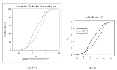
We begin by reading in the data (section 1.1.14) as a comma separated file from the book web site (section 1.1.6).
SAS
filename myurl
   url 'http://www.math.smith.edu/sasr/datasets/help.csv'
   lrecl=704;

proc import
   datafile=myurl out=ds dbms=dlm;
   delimiter=',';
   getnames=yes;
run;
SAS proc univariate can do this plot automatically (section 5.1.15). It is designed to compare two groups within the data set, using the class statement (section 3.1.3).
proc univariate data=ds;
   var pcs;
   class female;
   cdfplot pcs / overlay;
run;
In R, the plot() function accepts ecdf() objects (section 5.1.15) as input. Applying this to pcs, conditional on including only the rows when female is 1 (section B.4.2) creates the first empirical CDF as well as the axes. The lines() function (section 5.2.1) also accepts ecdf() objects as input, and applying this to pcs when female is 0 adds the second empirical CDF to the existing plot. A legend (section 5.2.14) is added to show which curve is which. (Note that the Blogger software prevents displaying this image large enough to see the difference here, but it will be visible when run locally.
R
> ds <- read.csv(
   "http://www.math.smith.edu/sasr/datasets/helpmiss.csv")
> attach(ds)
> plot(ecdf(pcs[female==1]), verticals=TRUE, pch=46)
> lines(ecdf(pcs[female==0]), verticals=TRUE, pch=46)
> legend(20, 0.8, legend=c("Women", "Men"), lwd=1:3)
Click the graphic below for a more legible image of the output.

4 comments:
thanks for the R plot!
Thanks! it was really useful, I wonder if you could help me, I need to create a table with data from that cumulative curve,how could I make it?
thanks!
The knots() function is helpful here. Try:
res = ecdf(pcs[female==1])
knots(res)
cbind(knots(res), res(knots(res)))
data titfig;
set titers;
where tit=1;
run;
proc univariate data=titfig;
var ln10Post;
class armname; ****A vs B ****;
cdfplot ln10Post / overlay;
run;
How to create the reverse Cumulative dist curve....
Post a Comment