The Bland-Altman plot is a visual aid for assessing differences between two ways of measuring something. For example, one might compare two scales this way, or two devices for measuring particulate matter.
The plot simply displays the difference between the measures against their average. Rather than a statistical test, it is intended to demonstrate both typical differences between the measures and any patterns such differences may take. The utility of the plot, as compared with linear regression or sample correlation is that the plot is not affected by the range, while the sample correlation will typically increase with the range. In contrast, linear regression shows the strength of the linear association but not how closely the two measures agree. The Bland-Altman plot allows the user to focus on differences between the measures, perhaps focusing on the clinical relevance of these differences.
A peer reviewer recently asked a colleague to consider a Bland-Altman plot for two methods of assessing fatness: the familiar BMI (kg/m^2) and the actual fat mass measured by a sophisticated DXA machine. These are obviously not measures of the same thing, so a Bland-Altman plot is not exactly appropriate. But since the BMI is so simple to calculate and the DXA machine is so expensive, it would be nice if the BMI could be substituted for DXA fat mass.
For this purpose, we'll generate a modified Bland-Altman plot in which each measure is first standardized to have mean 0 and standard deviation 1. The resulting plot should be assessed for pattern as usual, but typical differences must be considered on the standardized scale-- that is, differences of a unit should be considered large, and good agreement might require typical differences of 0.2 or less.
SAS
Since this is a job we might want to repeat, we'll build a SAS macro to do it. This will also demonstrate some useful features. The macro accepts a data set name and the names of two variables as input. We'll comment on interesting features in code comments. If you're an R coder, note that SAS macro variables are merely text, not objects. We have to manually assign "values" (i.e., numbers represented as text strings) to newly created macro variables.
%macro baplot(datain=,x=x,y=y);

/* proc standard  standardizes the variables and saves the results in the
   same variable names in the output data set.  This means we can continue
   using the input variable names throughout. */
proc standard data = &datain out=ba_std mean=0 std=1;
var &x &y;
run;

/* calculate differences and averages */
data ba;
set ba_std;
bamean = (&x + &y)/2;;
badiff = &y-&x;
run;

ods output summary=basumm;
ods select none;
proc means data = ba mean std;
var badiff;
run;
ods select all;

/* In the following, we take values calculated from a data set for the
   confidence limits and store them in macro variables.  That's the
   only way to use them later in code.
   The syntax is: call symput('varname', value);
   Note that 'bias' is purely nominal, as the standardization means that
   the mean difference is 0. */
data lines;
set basumm;
call symput('bias',badiff_mean);
call symput('hici',badiff_mean+(1.96 * badiff_stddev));
call symput('loci',badiff_mean-(1.96 * badiff_stddev));
run;

/* We use the macro variables just created in the vref= option below;
   vref draws reference line(s) on the vertical axis.  lvref specifies
   a line type. */
symbol1 i = none v = dot h = .5;
title "Bland-Altman type plot of &x and &y";
title2 "&x and &y standardized";
proc gplot data=ba;
plot badiff * bamean / vref = &bias &hici &loci lvref=3;
label badiff = "difference" bamean="mean";
run;
%mend baplot;
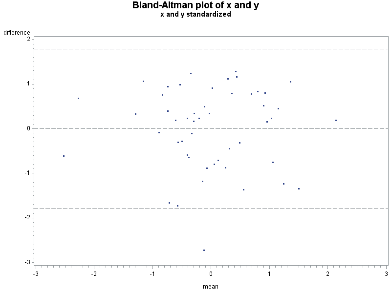
Here is a fake sample data set, with the plot resulting from the macro shown above. An analysis would suggest that despite the correlation of 0.59 and p-value for the linear association < .0001, that these two measures don't agree too well.
data fake;
do i = 1 to 50;
/* the "42" in the code below sets the seed for the pseudo-RNG
   for this and later calls.  See section 1.10.9. */
  x = normal(42);
  y = x + normal(0);
  output;
  end;
run;

%baplot(datain=fake, x=x, y=y);
R
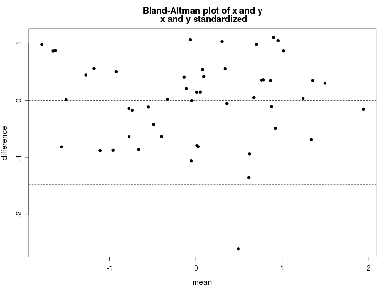
Paralleling SAS, we'll write a small function to draw the plot, annotating within to highlight some details. If you're primarily a SAS coder, note the syntax needed to find the name of an object submitted to a function. In contrast, assigning values to new objects created with the function is entirely natural. The resulting plot is shown below.
# set seed, for replicability
set.seed(42)
x = rnorm(50)
y = x + rnorm(50)

baplot = function(x,y){
  xstd = (x - mean(x))/sd(x)
  ystd = (y - mean(y))/sd(y)

  bamean = (xstd+ystd)/2
  badiff = (ystd-xstd)

  plot(badiff~bamean, pch=20, xlab="mean", ylab="difference")
# in the following, the deparse(substitute(varname)) is what retrieves the
# name of the argument as data
  title(main=paste("Bland-Altman plot of x and y\n",
    deparse(substitute(x)), "and", deparse(substitute(y)),
    "standardized"), adj=".5")
#construct the reference lines on the fly: no need to save the values in new
# variable names
  abline(h = c(mean(badiff), mean(badiff)+1.96 * sd(badiff),
    mean(badiff)-1.96 * sd(badiff)), lty=2)
}

baplot(x,y)
An unrelated note about aggregators:We love aggregators! Aggregators collect blogs that have similar coverage for the convenience of readers, and for blog authors they offer a way to reach new audiences. SAS and R is aggregated by R-bloggers, PROC-X, and statsblogs with our permission, and by at least 2 other aggregating services which have never contacted us. If you read this on an aggregator that does not credit the blogs it incorporates, please come visit us at SAS and R. We answer comments there and offer direct subscriptions if you like our content. In addition, no one is allowed to profit by this work under our license; if you see advertisements on this page, the aggregator is violating the terms by which we publish our work.
6 comments:
nice! Note you have a specific function to center/standardise variable, scale(). So:
(x - mean(x))/sd(x)
can be replaces by scale(x)
Thanks. The scale() function is vectorized and probably more efficient than simple code, both of which could make a difference in large data sets or repeated application.
On the pedagogical side:
You took the time to demonstrate the deparse(substitute(varname)) functionality but then used the same variable names (x and y) to call the function. Thus the user might not see the effect. Readers might want to run the following code (after running all the previous R code):
dxa <- x
bmi <- y
baplot(dxa, bmi)
Thanks, Chris! Quite right.
Many Thanks Ken for the code.
Wouldn't it be more appropriate thought to expand the limit of the y-axis as follow:
baplot = function(x,y){
xstd = (x - mean(x))/sd(x)
ystd = (y - mean(y))/sd(y)
bamean = (xstd+ystd)/2
badiff = (ystd-xstd)
ylim_val = mean(badiff)+3*sd(badiff)
plot(badiff~bamean, pch=20, xlab="mean", ylab="difference", ylim = c(-ylim_val,ylim_val))
# in the following, the deparse(substitute(varname)) is what retrieves the
# name of the argument as data
title(main=paste("Bland-Altman plot of x and y\n",
deparse(substitute(x)), "and", deparse(substitute(y)),
"standardized"), adj=".5")
#construct the reference lines on the fly: no need to save the values in new
# variable names
abline(h = c(mean(badiff), mean(badiff)+1.96 * sd(badiff),
mean(badiff)-1.96 * sd(badiff)), lty=2)
}
baplot(x,y)
Interesting idea, Anonymous. If I read your code correctly, you are forcing the y-axis to stop at 3 times the SD, plus or minus.
There is a risk here that you will cut off any larger outliers-- they would not show on your plot, which I don't think was your intent.
Instead, I think you had intended to avoid the appearance of the example plot, where roughly agreeing data might appear to be in disagreement.
You might fix both problems with some comparison between the max deviation and the 3*sd, I think. But for myself, I'm happy with the standard limits.
Post a Comment