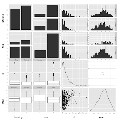
Pairs plots (section 5.1.17) are a useful way of displaying the pairwise relations between variables in a dataset. But the default display is unsatisfactory when the variables aren't all continuous. In this entry, we discuss ways to improve these displays that have been proposed by John Emerson, Walton Green, Barret Schloerke, Dianne Cook, Heike Hofmann, and Hadley Wickham in a manuscript under review entitled The Generalized Pairs Plot. http://www.blogger.com/img/blank.gif
Implementations of the methods in the paper are available in the gpairs and GGally packages; here we use the latter, which is based on the grammar of graphics and the ggplot2 package. This is an R-only entry: we are unaware of efforts to replicate this approach in SAS.
New users may find it easier to break process down into steps, rather than to do everything at once, as the R language allows. One way to do that is to make a smaller version of a dataset, with just the analysis variables included. here we use the HELP data set and choose two categorical variables (gender and housing status) and two continuous ones (the number of drinks per day and a measure of depressive symptoms). Once this new subset is created, the call to ggpairs() is straightforward.
R
library(GGally)
ds = read.csv("http://www.math.smith.edu/r/data/help.csv")
ds$sex = as.factor(ifelse(ds$female==1, "female", "male"))
ds$housing = as.factor(ifelse(ds$homeless==1, "homeless", "housed"))
smallds = subset(ds, select=c("housing", "sex", "i1", "cesd"))
ggpairs(smallds, diag=list(continuous="density", discrete="bar"), axisLabels="show")
For users more comfortable with R, the ggpairs function allows you to select variables to include, via its columns option. The following line produces a plot identical to the above, without the subset().
ggpairs(ds, columns=c("housing", "sex", "i1", "cesd"),
    diag=list(continuous="density",   discrete="bar"), axisLabels="show")
Various options are available for the diagonal elements of the plot matrix, and the off-diagonals can be controlled with upper and lower options. The examples(ggpairs) command is very helpful for visualizing some of the possibilities.
4 comments:
thanks, but will like a longer article
You should be able to create the equivalent with SAS Graph and the SAS GTL in SAS 9.2. I don't have home access or I would attempt to put it together for you.
Hello,
I'm running this example on
R version 3.2.2 (2015-08-14) -- "Fire Safety"
running under RStudio 0.99.484 (windows 7).
I get this error message:
'stat_bin: binwidth defaulted to range/30. Use 'binwidth = x' to adjust this.'
I've looked at the help file, and can't figure out how to supply that argument.
It's presumably under the 'params=...', but I can't figure out how to fit that into the command:
ggpairs(smallds, diag=list(continuous="density", discrete="bar"), Params=c(binwidth = 10), axisLabels="show")
Do you have any suggestions?
Thanks!
Barry
................and, of course, the minute I hit 'post', I discovered my typo :(
Thanks for this blog post - it helped a lot!
Post a Comment