We've continued to get useful feedback and ideas from our posts on the combination dotplot/boxplot and other ways to craft similar displays.
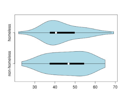
Another notion is the violin plot, which combines a boxplot and a (doubled) kernel density plot. While the basic notion of the violin plot does not include the individual points, such a display has virtues, particularly when comparing multiple groups and with large datasets. For teaching purposes, dots representing the data points could be added in. More details on the plot can be found in: Hintze, J. L. and R. D. Nelson (1998). Violin plots: a box plot-density trace synergism. The American Statistician, 52(2):181-4.
R
In R, the vioplot package includes the vioplot() function, which generated the plot at the top of this entry.
ds = read.csv("http://www.math.smith.edu/r/data/help.csv")
female = subset(ds, female==1)
library(vioplot)
with(female, vioplot(pcs[homeless==0], pcs[homeless==1],
   horizontal=TRUE, names=c("non-homeless", "homeless"),
   col = "lightblue"))
SAS
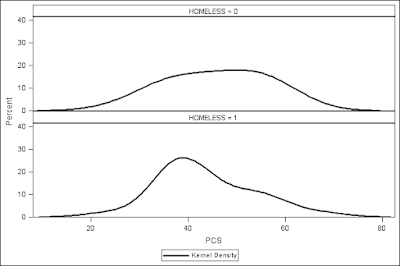
We've neglected SAS in the discussion of teaching graphics. Mimicking the tailored appearance of Wild's approach to the dotplot-boxplot would require at least several hours, while even the shorter code suggested by commenters would be difficult. For the most part this reflects the modular nature of R. However violin plots are similar enough to stacked kernel density estimates, that we show them here in order to demonstrate the code.
proc sgpanel data="C:\book\help";
  where female eq 1;
  panelby homeless / columns=1 ;
  density pcs / scale=percent type=kernel ;
run;
The output lacks the graphic depiction of central tendency, and does not double the density, but it does highlight similarities and differences between the categories.

No comments:
Post a Comment