Tuesday, October 26, 2010

Example 8.11: violin plots


We've continued to get useful feedback and ideas from our posts on the combination dotplot/boxplot and other ways to craft similar displays.

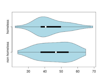
Another notion is the violin plot, which combines a boxplot and a (doubled) kernel density plot. While the basic notion of the violin plot does not include the individual points, such a display has virtues, particularly when comparing multiple groups and with large datasets. For teaching purposes, dots representing the data points could be added in. More details on the plot can be found in: Hintze, J. L. and R. D. Nelson (1998). Violin plots: a box plot-density trace synergism. The American Statistician, 52(2):181-4.

R

In R, the vioplot package includes the vioplot() function, which generated the plot at the top of this entry.

ds = read.csv("http://www.math.smith.edu/r/data/help.csv")
female = subset(ds, female==1)
library(vioplot)
with(female, vioplot(pcs[homeless==0], pcs[homeless==1],
horizontal=TRUE, names=c("non-homeless", "homeless"),
col = "lightblue"))


SAS

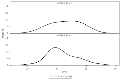
We've neglected SAS in the discussion of teaching graphics. Mimicking the tailored appearance of Wild's approach to the dotplot-boxplot would require at least several hours, while even the shorter code suggested by commenters would be difficult. For the most part this reflects the modular nature of R. However violin plots are similar enough to stacked kernel density estimates, that we show them here in order to demonstrate the code.

proc sgpanel data="C:\book\help";
where female eq 1;
panelby homeless / columns=1 ;
density pcs / scale=percent type=kernel ;
run;

The output lacks the graphic depiction of central tendency, and does not double the density, but it does highlight similarities and differences between the categories.

Sunday, October 24, 2010

Reader suggestions on alternative ways to create combination dotplot/boxplot


Kudos to several of our readers, who suggested simpler ways to craft the graphical display (combination dotplot/boxplot) from our most recent example.

Yihui Xie combines a boxplot with a coarsened version of the PCS scores (using the round() function) used in the stripchart() function.

ds = read.csv("http://www.math.smith.edu/r/data/help.csv")
smallds = subset(ds, female==1)
boxplot(pcs~homeless, data=smallds,
horizontal=TRUE)
stripchart(round(pcs)~homeless,
method='stack', data=smallds,
add=TRUE)

This is far simpler than the code we provided, though aesthetically is perhaps less pleasing.

An alternative approach was suggested by NetDoc, who creatively utilizes the ggplot2 package authored by Hadley Wickham. This demonstrates how a complex plot can be crafted by building up components using this powerful system. This approach dodges points so that they don't overlap.


source("http://www.math.smith.edu/sasr/examples/wild-helper.R")
ds = read.csv("http://www.math.smith.edu/r/data/help.csv")
female = subset(ds, female==1)
theme_update(panel.background = theme_rect(fill="white", colour=NA))
theme_update(panel.grid.minor=theme_line(colour="white", size=NA))
p = ggplot(female, aes(factor(homeless), pcs))
p + geom_boxplot(outlier.colour="transparent") +
geom_point(position=position_dodge(width=0.2), pch="O") +
opts(title = "PCS by Homeless") +
labs(x="Homeless", y="PCS") +
coord_flip() +
opts(axis.colour="white")


This is also simpler than the approach taken by Wild and colleagues. The increased complexity of Wild's function is the cost of maintaining a consistent integrated appearance with the other pieces of their package. In addition, the additional checking of appropriate arguments is also important for code used by others.

Tuesday, October 19, 2010

Example 8.10: Combination dotplot/boxplot (teaching graphic in honor of World Statistics Day)


In honor of World Statistics Day and the read paper that my co-authors Chris Wild, Maxine Pfannkuch, Matt Regan, and I are presenting at the Royal Statistical Society today, we present the R code to generate a combination dotplot/boxplot that is useful for students first learning statistics. One of the over-riding themes of the paper is that introductory students (be they in upper elementary or early university) should keep their eyes on the data.

When describing distributions, students often are drawn to the most visually obvious aspects: median, quartiles and extremes. These are the ingredients of the basic boxplot, which is often introduced as a graphical display in introductory courses. Students are taught to calculate the quartiles, and this becomes one of the components of a boxplot.

One limitation of the boxplot is that it loses the individual data points. Given a dotplot (see here for an example of one in Fathom), it is very easy to guesstimate and draw a boxplot by hand. Wild et al. argue that doing so is probably the best way of gaining an appreciation of just what a boxplot actually is. The boxplot provides a natural bridge between operating entirely in terms of what is seen in graphics to reasoning using summary statistics. Retaining the dots in the combination dotplot/boxplot provides a reminder that the box plot is just summarizing the raw data, thus preserving a connection to more concrete foundations.

Certainly, such a plot has a number of limitations. It breaks down when there are a large number of observations, and has redundancy not suitable for publication. But as a way to motivate informal inference, it has potential value. It's particularly useful when combined in an animation using multiple samples from a known population, as demonstrated here (scroll through the file quickly).

In addition, the code, drafted by Chris and his colleagues Steve Taylor and Dineika Chandrananda at the University of Auckland, demonstrates a number of useful and interesting techniques.

R

Because of the length of the code, we'll focus just on the boxpoints3() function shown below. The remaining support code must be run first (and can be found at http://www.math.smith.edu/sasr/examples/wild-helper.R). The original boxpoints() function has a large number of options and configuration settings, which the function below sets at the default values.

# Create a plot from two variables, one continuous and one categorical.
# For each level of the categorical variable (grps) a stacked dot plot
# and a boxplot summary are created. Derived from code written by
# Christopher Wild, Dineika Chandrananda and Steve Taylor
#
boxpoints3 = function(x,grps,varnames1,varnames2,labeltext)
{
observed = (1:length(x))[!is.na(x) & !is.na(grps)]
x = x[observed]
grps = as.factor(grps[observed])
ngrps = length(levels(grps))

# begin section to align titles and labels
xlims = range(x) + c(-0.2,0.1)*(max(x)-min(x))
top = 1.1
bottom = -0.2
plot(xlims, c(bottom,top), type="n", xlab="", ylab="", axes=F)
yvals = ((1:ngrps)-0.7)/ngrps
text(mean(xlims), top, paste(varnames1, "by", varnames2, sep=" "),
cex=1, font=2)
text(xlims[1],top-0.05,varnames2, cex=1, adj=0)
addaxis(xlims, ylev=0, tickheight=0.03, textdispl=0.07, nticks=5,
axiscex=1)
text(mean(xlims), -0.2, varnames1, adj=0.5, cex=1)
# end section for titles and labels

for (i in 1:ngrps) {
xi = x[grps==levels(grps)[i]]
text(xlims[1], yvals[i]+0.2/ngrps,
substr(as.character(levels(grps)[i]), 1, 12), adj=0, cex=1)
prettyrange = range(pretty(xi))
if (min(diff(sort(unique(xi)))) >= diff(prettyrange)/75)
xbins = xi # They are sufficiently well spaced.
else {
xbins = round(75 * (xi-prettyrange[1])/diff(prettyrange))
}
addpoints(xi, yval=yvals[i], vmax=0.62/ngrps, vadd=0.075/ngrps,
xbin=xbins, ptcex=1, ptcol='grey50', ptlwd=2)
bxplt = fivenum(xi)
if(length(xi) != 0)
addbox(x5=bxplt, yval=yvals[i], hbxwdth=0.2/ngrps,
boxcol="black", medcol="black", whiskercol="black",
boxfill=NA, boxlwidth=2)
}
}

Most of the function tends to issues of housekeeping, in particular aligning titles and labels. Once this is done, the support functions addpoints() and addbox() functions are called with the appropriate arguments. We can call the function using data from female subjects at baseline of the HELP study, comparing PCS (physical component scores) for homeless and non-homeless subjects.

source("http://www.math.smith.edu/sasr/examples/wild-helper.R")
ds = read.csv("http://www.math.smith.edu/r/data/help.csv")
female = subset(ds, female==1)
with(female,boxpoints3(pcs, homeless, "PCS", "Homeless"))

We see that the homeless subjects have lower PCS scores than the non-homeless (though the homeless group also has the highest score of either group in this sample).
Tuesday, October 12, 2010

Example 8.9: Contrasts

In example 8.6 we showed how to change the reference category. This is the natural first thought analysts have when their primary comparisons aren't represented in the default output. But our interest might center on a number of comparisons which don't share a category. Or we might need to compare one group with the mean of the other groups. Today we'll explore tests and estimates of effects like these, which are sometimes called contrasts. In a later entry we'll explore more complex multivariate contrasts.

SAS

Access to this kind of comparison in SAS is provided in many model-fitting procedures using a test, estimate, or contrast statement. The differences among these can be subtle. In general, for simple comparisons, we recommend the estimate statement, where available. It is available for the important glm and genmod procedures, among others. In our example from linear regression, we changed the referent from heroin to alcohol by sorting the data and using the order=data option. This gains us pairwise comparisons between heroin and alcohol and between cocaine and alcohol. Here we show how to get the comparison between heroin and cocaine from the same model fit.

proc sort data=help_a; by descending substance; run;

proc glm data=help_a order=data;
class substance;
model i1 = age substance / solution;
estimate "heroin vs. cocaine" substance -1 1 0 / e;
run; quit;

The syntax of the estimate statement is to optionally name the estimate (between the quotes) then to list the effects whose values we want to assess, followed by the desired values for each level of the effect. The e option requests that the contrast vector be printed-- this is a vital check that the contrast is working as desired. Here are the pieces of output generated by the estimate statement.

Coefficients for Estimate heroin vs. cocaine

Row 1
Intercept 0

AGE 0

SUBSTANCE heroin -1
SUBSTANCE cocaine 1
SUBSTANCE alcohol 0

This is the result of the e option, and shows that we've correctly specified the difference between heroin and cocaine.

Standard
Parameter Estimate Error t Value Pr > |t|
heroin vs. cocaine 3.00540049 2.15576257 1.39 0.1640

This is the comparison we want. It displays the difference, which we could confirm by examining the parameter estimates, as well as the standard error of the difference and the p-value, which can't be determined from the standard output.

To compare alcohol with the average of heroin and cocaine, we could use the following syntax (results omitted).

estimate "cocaine + alcohol vs heroin" substance -2 1 1 /e divisor=2;

The divisor option allows us to use portions that are not easily represented as decimals. It's necessary because of the reserved use of the / in SAS. Any number of estimate statements can be issued in a single proc.

R

The fit.contrast() function in the gmodels package will generate contrasts for lm and glm objects. Multivariate contrasts can be found in the contrast() function in the Design package.

ds = read.csv("http://www.math.smith.edu/r/data/help.csv")
lm3 = lm(i1 ~ substance + age, data=ds))
library(gmodels)
fit.contrast(lm3, "substance", c(0,-1, 1))

This generates the following output:

Estimate Std. Error t value Pr(>|t|)
substance c=( 0 -1 1 ) -3.005400 2.155763 -1.394124 0.1639696

The simple syntax accepts model objects, the name of the effect, and a vector of contrasts to apply. The function does not replicate the contrast, which would be useful, but it is simple enough to check the parameter estimates from the model to ensure the desired result has been obtained.

The syntax for comparing heroin with the mean of alcohol and cocaine is straightforward.

> fit.contrast(lm3,"substance", c(-.5, -.5,1))
Estimate Std. Error t value Pr(>|t|)
substance c=( -0.5 -0.5 1 ) -11.09965 1.904192 -5.829059 1.065763e-08

Tuesday, October 5, 2010

Example 8.8: more Hosmer and Lemeshow

This is a special R-only entry.

In Example 8.7, we showed the Hosmer and Lemeshow goodness-of-fit test. Today we demonstrate more advanced computational approaches for the test.

If you write a function for your own use, it hardly matters what it looks like, as long as it works. But if you want to share it, you might build in some warnings or error-checking, since the user won't know its limitations the way you do. (This is likely good advice even if you are the only one to use your code!)

In R, you can add another layer of detail so that your function conforms to standards for built-in functions. This is a level of detail we don't pursue in our book, but is worth doing in many settings. Here we provided a modified version of a Hosmer-Lemeshow test sent to us by Stephen Taylor of the Auckland University of Technology. We've added a few annotations.

Note that the function accepts a glm object, rather than the two vectors our function used.

hosmerlem2 = function(obj, g=10) {
# first, check to see if we fed in the right kind of object
stopifnot(family(obj)$family=="binomial" && family(obj)$link=="logit")
y = obj$model[[1]]
# the double bracket (above) gets the index of items within an object
if (is.factor(y))
y = as.numeric(y)==2
yhat = obj$fitted.values
cutyhat = cut(yhat, quantile(yhat, 0:g/g), include.lowest=TRUE)
obs = xtabs(cbind(1 - y, y) ~ cutyhat)
expect = xtabs(cbind(1 - yhat, yhat) ~ cutyhat)
if (any(expect < 5))
warning("Some expected counts are less than 5. Use smaller number of groups")
chisq = sum((obs - expect)^2/expect)
P = 1 - pchisq(chisq, g - 2)
# by returning an object of class "htest", the function will perform like the
# built-in hypothesis tests
return(structure(list(
method = c(paste("Hosmer and Lemeshow goodness-of-fit test with", g, "bins", sep=" ")),
data.name = deparse(substitute(obj)),
statistic = c(X2=chisq),
parameter = c(df=g-2),
p.value = P
), class='htest'))
}

We can run this using last entry's data from the HELP study.

ds = read.csv("http://www.math.smith.edu/r/data/help.csv")
attach(ds)
logreg = glm(homeless ~ female + i1 + cesd + age + substance,
family=binomial)

The results are the same as before:

> hosmerlem2(logreg)
Hosmer and Lemeshow goodness-of-fit test with 10 bins

data: logreg
X2 = 8.4954, df = 8, p-value = 0.3866