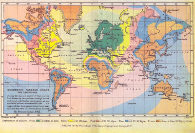
Typical uses include weather maps displaying "isobars" (lines of constant pressure), and maps displaying lines of constant elevation useful in, e.g., hiking. Unusual examples include maps of constant travel time, for example this map, which transforms space so that constant travel time can be presented as circles, or Francis Galton's travel map, below, in which the lines of constant travel time are reflected in the borders between colors.

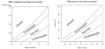
As an example, here, we plot iso-BMI lines showing regions of underweight, normal weight, overweight, and obesity. As presented by National Heart, Lung, and Blood Institute, the borders between these categories are at BMI of 18.5, 25, and 30. Leaving aside questions of whether risk changes precipitously at these conveniently round numbers, it would be helpful to see what the categories imply across a range of heights and weights.
SAS
In SAS, we loop (section 1.11.1) through a range of heights (English) and weights (avoirdupois), calculating the BMI for each.
data bmi;
  do ht = 48 to 84 by ((84-48)/1000);
    do wt = 90 to 300 by ((300 -90)/1000);
      bmi = (wt*703)/(ht**2);
   output;
 end;
  end;
run;
We then prepare some labels for the plot, using the annotate macros (section 5.2, 5.2.11).
%annomac;
data annobmi;
  %system(2,2,2);
  %label(75,120,"Underweight",black,18,0,17);
  %label(70,150,"Normal",black,33,0,17);
  %label(65,170,"Overweight",black,37,0,17);
  %label(55,200,"Obese",black,40,0,17);
  run;
Finally, we use proc contour (section 5.1.12) to make the contour plot, using the anno option to plot the labels.
title h=1.25 "BMI categories by height and weight";
proc gcontour data = bmi anno=annobmi;
  plot wt * ht = bmi / levels = 18.5,25,30 nolegend;
  label ht="Height (inches)" wt="Weight (lbs)";
run;
R
In R, we build the data using the seq() function (section 1.11.3) for height and weight separately, and generate a data frame with all combinations of height and weight with the expand.grid() function (see example 7.22). After defining a function to calculate the BMI once, we apply it to the whole data set, storing the results in the matrix form we'll need using the matrix() function (section 1.9.1).
ht = seq(48,84, length.out=1000)
wt = seq(90,300, length.out=1000)
wtht = expand.grid(x=ht, y=wt)
bmi = function(h,w) {(w * 703)/(h*h)}
bmiwtht = matrix(bmi(wtht$x,wtht$y),length(ht),length(wt))
Now we're ready to use the contour() function (section 5.1.12) to make the plot and to add the labels with the text() function (section 5.2.11).
contour(ht,wt,bmiwtht,levels = c(18.5,25,30), drawlabels=FALSE,
        xlab="Height (inches)",ylab="Weight (lbs)",
        main="BMI categories by height and weight")

text(55,200,"Obese",cex=2,srt=45)
text(65,165,"Overweight",cex=2,srt=40)
text(70,150,"Normal",cex=2,srt=35)
text(75,120,"Underweight",cex=2,srt=18)

No comments:
Post a Comment