Tuesday, September 29, 2009

Example 7.14: A simple graphic of sales

In this example, we show a simple plot of the sales rank data read in as shown in example 7.13.

SAS
In SAS, we use the symbol statement (section 5.3) to request small (with the h option) dots (with the v option, and that the dots not be connected (with the i option. (See sections 5.2.2, 5.3.9 for more details.)
we request a scatter plot with the gplot procdure (section 5.1.1), and tell SAS how to display the date/time values using the format statement (section A.6.4).


symbol1 v=dot i=none h=.2;
proc gplot data=sales;
plot rank*salestime;
format salestime datetime7.;
run;


Note in the results that the default SAS behavior is to use round and regular axis tick marks, in this case wasting a great deal of space on both axes. Similarly, the orientation of the y-axis labels uses up much space as well. We'll fix this behavior in a later entry.

R
In contrast, the R code is both simpler and more attractive by default; the plot() function (section 5.1.1) has a default treatment for date/time-formatted variables. Our only modification to the defaults is to request dots (with the pch option (section 5.2.2) instead of the default open circles.


plot(timeval, rank, pch=20)


Interpretation: As noted in a previous entry, information about the Amazon sales rank is relatively scant. Amazon considers the number of books it sells to be a competitive secret, and it discloses little information about how the rank is calculated. However, by examining the plot above, we can make some deductions. First, sales ranks are updated at least hourly. Second, there appears to be some adjustment for time of day. This would explain the smooth changes in direction during, for example, the first series of ~20 observations. In contrast, notable discontinuous changes in rank apparently signify sales; for a book with small circulation, such as this one, we can assume that most hours contain only one sale.

Thursday, September 24, 2009

Example 7.13: Read a file with two lines per observation

In example 7.6 we showed how to retrieve the Amazon sales rank of a book. A cron job on one of our machines grabs the sales rank hourly. We’d like to use this data to satisfy our curiosity about when and how often a book sells.

A complication is that the result of the cron job is a file with the time of the sales rank retrieval on one line and the rank retrieved on the following line. Here are some example lines frome the file:

Sun Aug 9 14:38:13 EDT 2009
salesrank= 141913
Sun Aug 9 14:40:04 EDT 2009
salesrank= 141913
Sun Aug 9 15:00:05 EDT 2009
salesrank= 149556
Sun Aug 9 16:00:05 EDT 2009
salesrank= 158132
Sun Aug 9 17:00:05 EDT 2009
salesrank= 166742

In the example below, we show how to read this data into SAS or R so that there is one observation (or row) per time. In a later entry, we'll build a graphic to display it.

SAS
In SAS, we use the infile statement (section 1.1.2) to read the data, as this affords the most control. As in section 6.4.1, we read a key character from the start of the line, holding that line with the trailing ”@” character. Then, dependent on the value of that character, we use different input statements to read in the date and time values on the one hand, or the rank. If the line does not contain the rank, we read in character values containing the day and time in formats which SAS can interpret, then convert this value to a SAS date-time value using an informat (section A.6.4) applied to a new character string made up of the date and time information. We keep these variable values using the retain statement (as in section 6.4.1). If the line has a rank, we read in the rank and write out the line using the output statement. Note that we do not use either the day of week or the time zone. Finally, we check the data by printing a few lines.


data sales;
infile "c:\data\sales.dat";
retain day month date time edt year;
input @1 type $1 @;
if type ne 's' then do;
input @1 day $ Month $ year time $ edt $ year;
end;
else do;
input @12 rank;
datetime = compress(date||month||year||"/"||time);
salestime = input(datetime,datetime18.);
output;
end;
run;

proc print data=sales (obs=6);
var datetime salestime rank;
run;

Obs datetime salestime rank

1 9Aug2009/14:38:13 1565447893 141913
2 9Aug2009/14:40:04 1565448004 141913
3 9Aug2009/15:00:05 1565449205 149556
4 9Aug2009/16:00:05 1565452805 158132
5 9Aug2009/17:00:05 1565456405 166742
6 9Aug2009/18:00:05 1565460005 175812


R
In R, we begin by reading the file (this is done relative to the current working directory (see getwd(), section 1.7.3). We then calculate the number of entries by dividing the file's length by two.

Next, we create two empty vectors of the correct length and type to store the data in, once we extract it from the file.

Once this preparatory work is completed, we loop (section 1.1.11) through the file, reading in the odd-numbered lines (lines (i-1)*2+1), some date/time values from the Eastern US time zone, with daylight savings applied. The gsub() function (also used in section 6.4.1 and related to the grep() function in 1.4.6) is used to replace matches determined by regular expression matching. In this situation, it is used to remove the time zone from the line before this processing. These date/time values are read into the timeval vector. Even-numbered lines (lines i*2) are read into the rank vector, after removing the string "salesrank=" (again using gsub()).

Finally, we make a data frame (section B.4.5) from the two vectors and display the first few lines using the head() function (section 1.13.1).


file <- readLines("sales.dat")
n <- length(file)/2
rank <- numeric(n)
timeval <- as.POSIXlt(rank, origin="1960-01-01")
for (i in 1:n) {
timeval[i] <- as.POSIXlt(gsub('EST', '',
gsub('EDT', '', file[(i-1)*2+1])),
tz="EST5EDT", format="%a %b %d %H:%M:%S %Y")
rank[i] <- as.numeric(gsub('salesrank= ','',file[i*2]))
}
timerank <- data.frame(timeval, rank)

We can review the results:

> head(timerank)
timeval rank
1 2009-08-09 14:38:13 141913
2 2009-08-09 14:40:04 141913
3 2009-08-09 15:00:05 149556
4 2009-08-09 16:00:05 158132
5 2009-08-09 17:00:05 166742
6 2009-08-09 18:00:05 175812

Thursday, September 17, 2009

Example 7.12: Calculate and plot a running average

The Law of Large Numbers concerns the stability of the mean, as sample sizes increase. This is an important topic in mathematical statistics. The convergence (or lack thereof, for certain distributions) can easily be visualized in SAS and R (see also Horton, Qian and Brown, 2004).

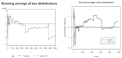
Assume that X1, X2, ..., Xn are independent and identically distributed realizations from some distribution with center mu. We define x-bar(k) as the average of the first k observations. Recall that because the expectation of a Cauchy random variable is undefined (Romano and Siegel, 1986) the sample average does not converge to the population parameter.

SAS
In SAS, we begin by writing a macro (section A.8) to generate the random variables and calculate the running average.

The macro runs a data step to generate the data and calculate the average after each value is generated using the sum function (section 1.8.1). The macro accepts the name of a data set to hold the variates and their running average, the number of random variates to generate, and the argument(s) to the rand function (section 1.10) so that variates from many distributions can be generated. For the purposes of making a dramatic example, we set a fixed random number seed (section 1.10.9).


%macro runave(outdata=, n=, distparms=) ;
data &outdata;
call streaminit(1984);
do i = 1 to &n;
x = rand &distparms;
runtot = sum(x, runtot);
avex = runtot/i;
output;
end;
run;
%mend runave;


In this example, we compare the Cauchy distribution to a t distribution with 4 degrees of freedom (for which the average does converge to the mean) for 1000 observations. To do this, we call the macro twice.


%runave(outdata=cauchy, n=1000, distparms= ("CAUCHY"));
%runave(outdata=t4, n=1000, distparms= ('T',4));


To plot the two running averages on a single figure, we combine the two data sets, using the in= data set option to identify which data set each observation came from. Then we plot the two curves using the a*b=c syntax for proc gplot (section 5.2.2). To connect the dots and choose line styles and colors, we use the symbol statement (sections 5.3.9-11), and a title statement (section 5.2.9) to add a title. SAS generates a legend by default with the a*b=c syntax.


data c_t4;
set cauchy t4 (in=t4);
if t4 then dist="t with 4 df";
else dist="Cauchy";
run;

symbol1 i=j c=black l=1 w=2;
symbol2 i=j c=black l=2 w=2;

title"Running average of two distributions";
proc gplot data=c_t4;
plot avex * i = dist / vref=0;
run;
quit;


R
Within R, we define a function (section B.5.2) to calculate the running average for a given vector, again allowing for variates from many distributions to be generated.


runave <- function(n, gendist, ...) {
x <- gendist(n, ...)
avex <- numeric(n)
for (k in 1:n) {
avex[k] <- mean(x[1:k])
}
return(data.frame(x, avex))
}


Next, we generate the data, using our new function. To make sure we have a nice example, we first set a fixed seed (section 1.10.9).


vals <- 1000
set.seed(1984)
cauchy <- runave(vals, rcauchy)
t4 <- runave(vals, rt, 4)


Finally, we're ready to plot. We begin by making an empty plot with the correct x and y limits, using the type="n" specification (section 5.1.1). We then plot the running average using the lines function (section 5.2.1) and varying the line style (section 5.3.9) and thickness (section 5.3.11) with the lty and lwd specification. Finally we add a title (section 5.2.9) and a legend (section 5.2.14).


plot(c(cauchy$avex, t4$avex), xlim=c(1, vals), type="n")
lines(1:vals, cauchy$avex, lty=1, lwd=2)
lines(1:vals, t4$avex, lty=2, lwd=2)
abline(0, 0)
title("Running average of two distributions")
legend(vals*.6, -1, legend=c("Cauchy", "t with 4 df"),
lwd=2, lty=c(1,2))