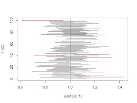
A colleague is a devotee of confidence intervals. To him, the CI have the magical property that they are immune to the multiple comparison problem-- in other words, he feels its OK to look at a bunch of 95% CI and focus on the ones that appear to exclude the null. This though he knows well the one-to-one relationship between 95% CIs that exclude the null and p-values below 0.05.
Today, we'll create a Monte Carlo experiment to demonstrate that fishing by CI is just as dangerous as fishing by p-value; generating the image above. We'll do this by replicating a bivariate experiment 100 times. Later, we'll examine the results of a single experiment with many predictors.
R
To begin with, we'll write a function to generate a single experiment, using a logistic regression. This is a simple modification of one of our first and most popular entries.
simci = function(){
  intercept = 0
  beta = 0
# beta = 0 because we're simulating under the null
# make the variance of x in this experiment vary a bit
  xtest = rnorm(1000) * runif(1,.6,1.4)
  linpred = intercept + xtest*beta
  prob = exp(linpred)/(1 + exp(linpred))
  runis = runif(1000)
  ytest = ifelse(runis < prob,1,0)
# now, fit the model
  fit = glm(ytest~xtest,family=binomial(link="logit"))
# the standard error of the estimates is easiest to find in the
  pe = summary(fit)$coefficients
# calculate the Wald CI; an alternative would be confint(), but
# that calculated profile CI, which take longer to generate
  ci = exp(c(pe[2,1] - 1.96*pe[2,2], pe[2,1] + 1.96*pe[2,2] ))
  return(ci)
}
Then we can use the replicate() function to repeat the experiment 100 times. The t() function (section 1.9.2) transposes the resulting matrix to have one row per experiment.
sim100 = t(replicate(100,simci()))

plot(x = sim100[,1], y = 1:100,
  xlim = c(min(sim100),max(sim100)), type="n")
segments(y0=1:100,x0=sim100[,1],y1 = 1:100,x1=sim100[,2],
  col = ifelse(sim100[,1]>1 | sim100[,2]<1,"red","black"))
abline(v=1)
The result is shown at the top. In the code, we set the limits of the x-axis by finding the max and min across the whole matrix-- this is a little wasteful of CPU cycles, but saves some typing. The segments() function (see example 8.42) is a vector-enabled line-drawer. Here we draw a line from the lower CI limit to the upper, giving the experiment number as the x value for each. We assign a red plot line if the CI excludes 1, using the ifelse() function (section 1.11.2), a vectorwise logic test. Finally, a reference line helps the viewer see for far the end of the CI is from the null. We omit prettying up the axis labels.
SAS
In SAS, considerably more lines are required. We begin by simulating the data, as in example 7.2. The modifications are to generate 100 examples with an outside do loop (section 1.11.1) and the random element added to the variance.
data simci;
beta = 0;
intercept = 0;
do sim = 1 to 100;   /* outer loop */
  xvar = (uniform(0) *.8) + .6;  /* variance != 1 */
  do i = 1 to 1000;
    xtest = normal(0) * xvar;
    linpred = intercept + (xtest * beta);
    prob =  exp(linpred)/(1 + exp(linpred));
    ytest = (uniform(0) < prob);
    output;
  end;
end;
run;
Then we fit the logistic regression. We leave in the ods trace commands (section A.7.1) to remind you how to find the SAS names of the output elements, needed to save the results in the ods output statement. The CI for the odds ratios are requested in the clodds statement, which accepts a pl value for a profile likelihood based interval.
*ods trace on/listing;
ods select none;
ods output cloddswald = lrci;
proc logistic data = simci;
by sim;
model ytest(event='1')=xtest / clodds=wald;
run;
*ods trace off;
ods select all;
Our plotting approach will require the "long" data set style, with two rows for each experiment. We'll generate that while checking whether the null is excluded from the CI.
data lrp2;
set lrci;
red = 0;
if lowercl > 1 or uppercl < 1 then red = 1;
point = lowercl; output;
point = uppercl; output;
run;
Finally, we're ready to make the graphic. We use the hilob interpolation to connect the upper and lower CI for each experiment; the b requests bars instead of a line, and the bwidth option specifies a very narrow bar. These options prevent the default plotting of the "mean" value with a tick. The a*b=c syntax (section 5.2.2) allows the different line colors.
symbol1 i=hilob bwidth=.05 c=black;
symbol2 i=hilob bwidth=.05 c=red;
proc gplot data = lrp2;
plot point * sim = red / vref = 1;
run;quit;
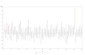
The result is just below. The vertical alignment seen in the R plot seems more natural, but this would not be possible with the hilo interpolation. As theory and logic would suggest, quite a few of the hundred simulated CI exclude the null, sometimes by a large proportion of the CI width.

An unrelated note about aggregators:We love aggregators! Aggregators collect blogs that have similar coverage for the convenience of readers, and for blog authors they offer a way to reach new audiences. SAS and R is aggregated by R-bloggers, PROC-X, and statsblogs with our permission, and by at least 2 other aggregating services which have never contacted us. If you read this on an aggregator that does not credit the blogs it incorporates, please come visit us at SAS and R. We answer comments there and offer direct subscriptions if you like our content. In addition, no one is allowed to profit by this work under our license; if you see advertisements on this page, the aggregator is violating the terms by which we publish our work.
No comments:
Post a Comment
Note: Only a member of this blog may post a comment.