Simpson's paradox is always amazing to explain to students. What's bad for one group, and bad for another group is good for everyone, if you just collapse over the grouping variable. Unlike many mathematical paradoxes, this arises in a number of real-world settings.
In this entry, we consider visualizing Simpson's paradox, using data from a study of average SAT scores, average teacher salaries and percentage of students taking the SATs at the state level (published by Deborah Lynn Guber, "Getting what you pay for: the debate over equity in public school expenditures" (1999), Journal of Statistics Education 7(2)).
R
The relevant data are available within the mosaic package.
> library(mosaic); trellis.par.set(theme=col.mosaic())
> head(SAT)
       state expend ratio salary frac verbal math  sat
1    Alabama  4.405  17.2 31.144    8    491  538 1029
2     Alaska  8.963  17.6 47.951   47    445  489  934
3    Arizona  4.778  19.3 32.175   27    448  496  944
4   Arkansas  4.459  17.1 28.934    6    482  523 1005
5 California  4.992  24.0 41.078   45    417  485  902
6   Colorado  5.443  18.4 34.571   29    462  518  980
The paradox manifests itself here if we ignore the fraction of students taking the SAT and instead consider the bivariate relationship between average teacher salary and average SAT score:
> lm(sat ~ salary, data=SAT)

Coefficients:
(Intercept)       salary
    1158.86        -5.54
Unfortunately, the relationship here appears to be negative: as salary increases,
average SAT score is predicted to decrease.
Luckily for the educators in the audience, once the confounding (aka lurking) variable is accounted for, we see a statistically significant positive relationship:
> summary(lm(sat ~ salary + frac, data=SAT))

Coefficients:
            Estimate Std. Error t value Pr(>|t|)
(Intercept) 987.9005    31.8775  30.991   <2e-16 ***
salary        2.1804     1.0291   2.119   0.0394 *
frac         -2.7787     0.2285 -12.163    4e-16 ***
---
Signif. codes:  0 ‘***’ 0.001 ‘**’ 0.01 ‘*’ 0.05 ‘.’ 0.1 ‘ ’ 1

Residual standard error: 33.69 on 47 degrees of freedom
Multiple R-squared: 0.8056, Adjusted R-squared: 0.7973
F-statistic: 97.36 on 2 and 47 DF,  p-value: < 2.2e-16
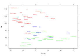
That's all well and good, but how to explain what is going on? We can start with a scatterplot, but unless the state names are plotted then it's hard to see what's going on (imagine the plot at the top of this entry without the text labels or the color shading).
It's straightforward to use the panel functionality within the lattice package to create a more useful plot, where states names are plotted rather than points, and different colors are used to represent the low (red), medium (blue) and high (green) values for the fraction of students taking the SAT.
SAT$fracgrp = cut(SAT$frac, breaks=c(0, 22, 49, 81),
  labels=c("low", "medium", "high"))
SAT$fraccount = 1 + as.numeric(SAT$fracgrp=="medium") +
  2*as.numeric(SAT$fracgrp=="high")
panel.labels = function(x, y, col='black', labels='x',...)
  { panel.text(x,y,labels,col=col,...)}
xyplot(sat ~salary, data=SAT, groups=fracgrp,
  cex=0.6, panel=panel.labels, labels=SAT$state,
  col=c('red','blue','green')[SAT$fraccount])
We see that within each group, the slope is positive (or at least non-negative), while overall there is a negative slope. Indeed, we see all of the hallmarks of a serious confounder in the correlation matrix for the n=50 observations:
> with(SAT, cor(cbind(sat, frac, salary)))
              sat       frac     salary
sat     1.0000000 -0.8871187 -0.4398834
frac   -0.8871187  1.0000000  0.6167799
salary -0.4398834  0.6167799  1.0000000
There's a strong negative association between SAT (Y) and fraction (Z), as well as a strong positive association between salary (X) and fraction (Z).
SAS
We begin by getting the data out of R. This is a snap, thanks to the proc_r macro we discussed here. Just read the macro in, tell it to grab the sat object on its way back from R, then write the R code to read in the data set. This technique would be great for getting data from the histdata package, discussed here, into SAS.
%include "C:\ken\sasmacros\Proc_R.sas";
%Proc_R (SAS2R =, R2SAS = sat);
Cards4;

mynorm = rnorm(10)
mynorm
library(mosaic)
head(SAT)
sat = SAT

;;;;
%Quit;
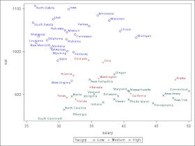
We'll skip the regression (best accomplished in proc glm) and skip to the helpful plot. We'll need to categorize the fraction taking the test. A natural way to do this in SAS would be to use formats, but we prefer to generate actual data as a more transparent process. To make the plot, we'll use the sgplot procedure. Typically this allows less control than the gplot procedure but the results in this case are quick and attractive. The group= and datalabel= options add the colors and legend, and the state names, respectively.
data sat2; set sat;
  if frac le 22 then fracgrp = "Low   ";
  else if frac le 49 then fracgrp = "Medium";
  else if frac gt 49 then fracgrp ="High";
run;

proc sgplot data=sat2;
  scatter x = salary y = sat / group=fracgrp datalabel=state;
run; quit;

Nice.
ReplyDeleteTwo links to Wikipedia are missing http:// so they resolve to blogspot.com as 404 not found.
Ugh. Thanks, fixed.
DeleteThis comment has been removed by a blog administrator.
ReplyDelete