A colleague recently asked "why should the average get closer to the mean when we increase the sample size?" We should interpret this question as asking why the standard error of the mean gets smaller as n increases. The central limit theorem shows that (under certain conditions, of course) the standard error must do this, and that the mean approaches a normal distribution. But the question was why does it? This seems so natural that it may have gone unquestioned in the past.
The best simple rationale may be that there are more ways to get middle values than extreme values--for example, the mean of a die roll (uniform discrete distribution on 1, 2, ..., 6) is 3.5. With one die, you're equally likely to get an "average" of 3 or of 1. But with two dice there are five ways to get an average of 3, and only one way to get an average of 1. You're 5 times more likely to get the value that's closer to the mean than the one that's further away.
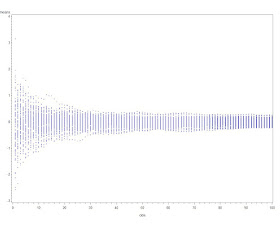
Here's a simple graphic to show that the standard error decreases with increasing n.
SAS
We begin by simulating some data-- normal, here, but of course that doesn't matter (assuming that the standard deviation exists for whatever distribution we pick and the sample size is appropriately large). Rather than simulate separate samples with n = 1 ... k, it's easier to add a random variate to a series and keep a running tally of the mean, which is easy with a little algebra. This approach also allows tracking the progress of the mean of each series, which could also be useful.
%let nsamp = 100;
data normal;
do sample = 1 to &nsamp;
  meanx = 0;
  do obs = 1 to &nsamp;
    x = normal(0);
 meanx = ((meanx * (obs -1)) + x)/obs;
 output;
  end;
end;
run;
We can now plot the means vs. the number of observations.
symbol1 i = none v = dot h = .2;
proc gplot data = normal;
plot meanx * obs;
run;
quit;

symbol1 i=join v=none r=&nsamp;
proc gplot data=normal;
  plot meanx * obs = sample / nolegend;
run; quit;
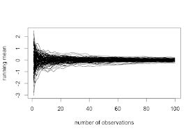
The graphic resulting from the first proc gplot is shown above, and demonstrates both how quickly the variability of the estimate of the mean decreases when n is small, and how little it changes when n is larger. A plot showing the means for each sequence converging can be generated with the second block of code. Note the use of the global macro variable nsamp assigned using the %let statement (section A.8.2).
R
We'll also generate sequences of variates in R. We'll do this by putting the random variates in a matrix, and treating each row as a sequence. We'll use the apply() function (sections 1.10.6 and B.5.3) to treat each row of the matrix separately.
numsim = 100
matx = matrix(rnorm(numsim^2), nrow=numsim)

runavg = function(x) { cumsum(x)/(1:length(x)) }
ramatx = t(apply(matx, 1, runavg))
The simple function runavg() calculates the running average of a vector and returns the a vector of equal length. By using it as the function in apply() we can get the running average of each row. The result must be transposed (with the t() function, section 1.9.2) to keep the sequences in rows. To plot the values, we'll use the type="n" option to plot(), specifying the first column of the running total as the y variable. While it's possible that the running average will surpass the average when n=1, we ignore that case in this simple demonstration.
plot(x=1:numsim, y = ramatx[,1], type="n",
  xlab="number of observations", ylab="running mean")
rapoints = function(x) points(x~seq(1:length(x)), pch=20, cex=0.2)
apply(ramatx,1,rapoints)

plot(x=1:numsim, y = ramatx[,1], type="n",
  xlab="number of observations", ylab="running mean")
ralines = function(x) lines(x~seq(1:length(x)))
apply(ramatx, 1, ralines)
Here we define another simple function to plot the values in a vector against the place number, then again use the apply() function to plot each row as a vector. The first set of code generates a plot resembling the SAS graphic presented above. The second set of code will connect the values in each sequence, with results shown below.

I'm definitely using this in my class this semester! :-)
ReplyDeleteStrictly speaking to show that standard error of the average decreases we need only independence and the existence of variance. For the ease assume that we have zero mean variables. Take average mean $Y=\frac{1}{n}\sum_{i=1}^nX_i$ and compute its variance: $var Y=\frac{1}{n}var X$. This goes to zero, as $n$ goes to infinity. We did not involve any central limit theorem, only simple algebra and probability.
ReplyDeleteWell, someone has to say it... :) What you're illustrating here is the law of large numbers and not the CLT.
ReplyDeleteAmen to the LLN vs CLT comment.
ReplyDeleteAlso, unless the goal is to demonstrate writing functions and using the apply function, the graphics can be created with matplot. For example,
matplot(t(ramatx), type='p', col=1, pch=20, cex=0.2)
matplot(t(ramatx), type='l', col=1, lty=1)
Finally, it isn't necessary that the number of simulations be equal to the sample size. I would encourage the following:
set.seed(20120112)
maxsamplesize = 1000
numsim = 15
matx = matrix(rnorm(numsim * maxsamplesize), nrow=numsim)
runavg = function(x) { cumsum(x)/(1:length(x)) }
ramatx = t(apply(matx, 1, runavg))
matplot(t(ramatx), type='p', col=1, pch=20, cex=0.2, xlab="number of observations", ylab="running mean")
matplot(t(ramatx), type='l', col=1, lty=1, xlab="number of observations", ylab="running mean")
abline(h=0, col=2)
This is not an article about CLT.
ReplyDeleteWhere are calculated means for samples with different size? Where is testing its distribution for normality?
Let generate some data from known distribution:
data <- rXXXXX(10000, params);
clt <- function(data, sample_size) {
means<-array(0, 200)
pvals <- array(0, 200)
for(i in 1:200) {
for(j in j:200) { means[j] <- mean(sample(data, sample_size)) }
pvals[i] <- shapiro.test(means)$p.val
}
length(pvals[pvals<0.05])/200
}
and run it for different sample_sizes: {5, 10, 20, 30, 50, 80, 100, 150, 200 etc.